Grove Bank
Grove Bank
Grove Bank
For the best experience, please view project pages on a desktop or laptop computer.


Cultivating a New Era in Banking
I was particularly excited when I received the assignment to design a conceptual bank website. With an interest in finance and a design style suited to fintech, I felt prepared to design and prototype the digital product.
Recognizing that most banks offer similar services, I aimed to differentiate my company with unique brand positioning and visual design. I envisioned Grove Bank as a sustainability-first financial institution where people could grow their finances while helping the planet.
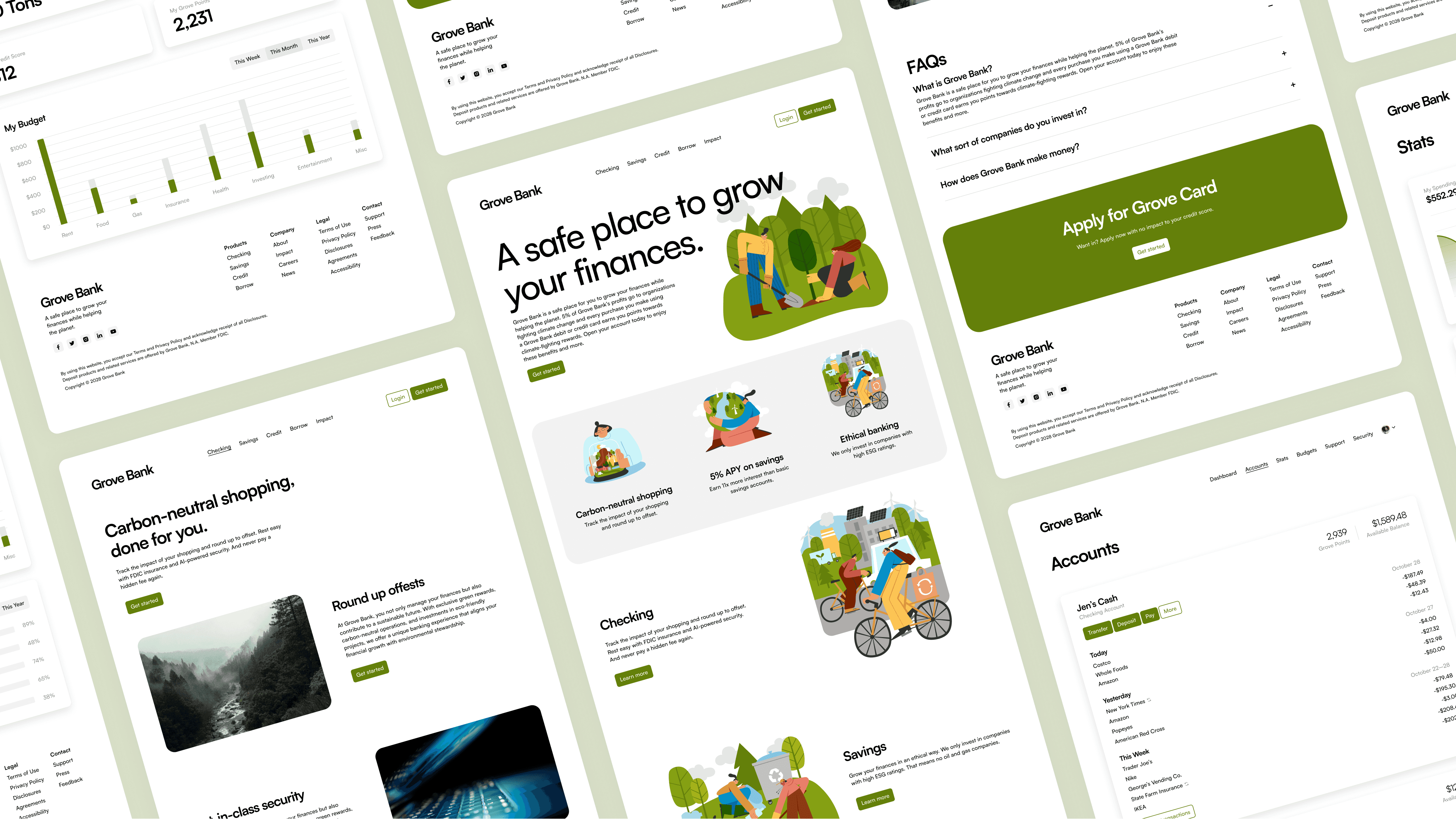
Photos from Unsplash. Illustrations by Freepik.
Cultivating a New Era in Banking
I was particularly excited when I received the assignment to design a conceptual bank website. With an interest in finance and a design style suited to fintech, I felt prepared to design and prototype the digital product.
Recognizing that most banks offer similar services, I aimed to differentiate my company with unique brand positioning and visual design. I envisioned Grove Bank as a sustainability-first financial institution where people could grow their finances while helping the planet.

Photos from Unsplash. Illustrations by Freepik.
Cultivating a New Era in Banking
I was particularly excited when I received the assignment to design a conceptual bank website. With an interest in finance and a design style suited to fintech, I felt prepared to design and prototype the digital product.
Recognizing that most banks offer similar services, I aimed to differentiate my company with unique brand positioning and visual design. I envisioned Grove Bank as a sustainability-first financial institution where people could grow their finances while helping the planet.

Photos from Unsplash. Illustrations by Freepik.
Surveying the Financial Landscape
To balance innovation with customer trust, I analyzed the websites of eight successful financial institutions. While most websites had excellent copy, they could benefit from more readable typography and greater visual uniformity.
I also investigated users’ pain points with current bank products, identifying key issues such as poor ethics, security concerns, inadequate support, high fees, and complexity.
I analyzed the websites of eight successful financial institutions during the UX research phase.
Crafting a Natural User Experience
Using insights from my competitive and SWOT analyses, I developed two user personas reflecting my target audience: 21–55-year-old middle-class Americans who value integrity, stewardship, and justice.
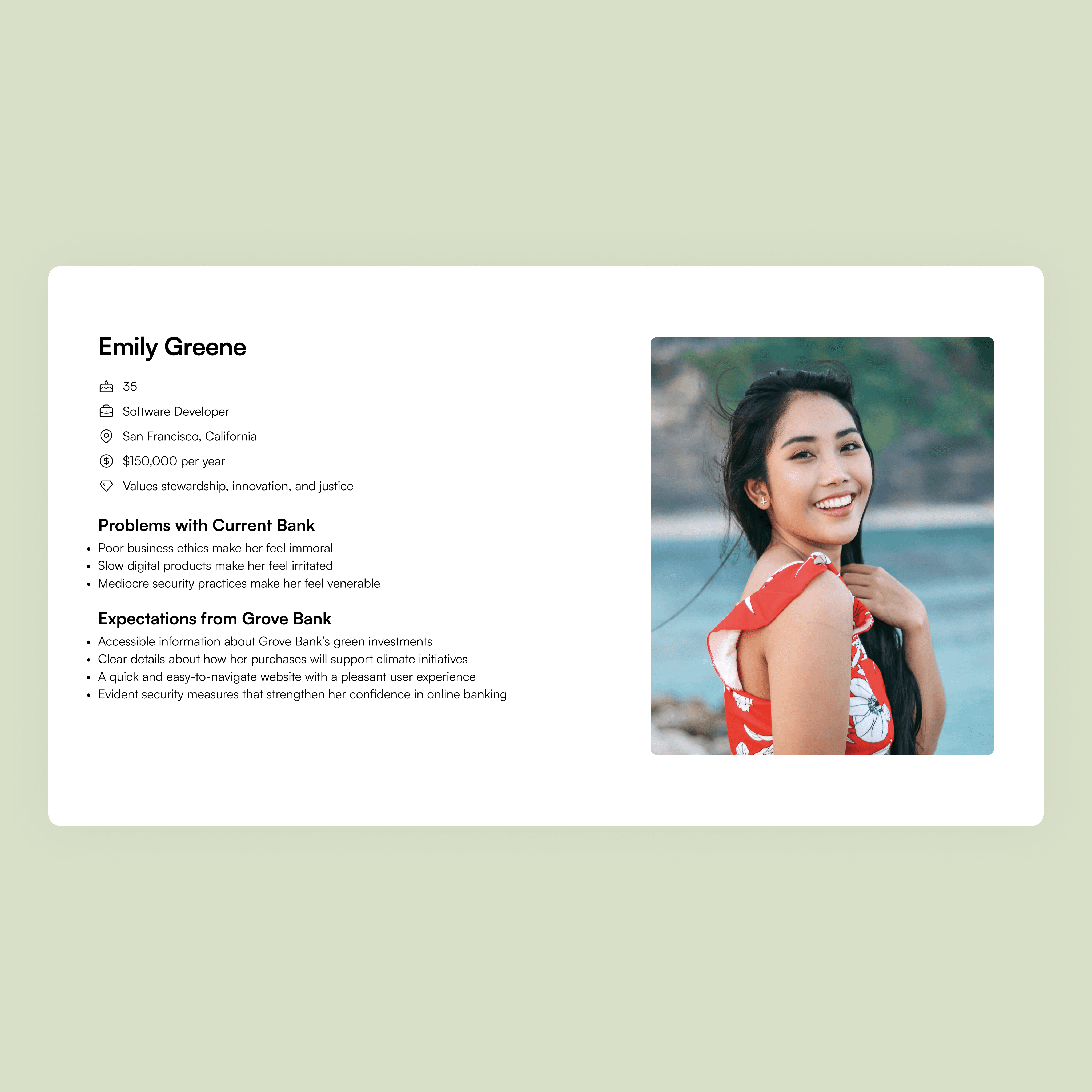

User personas reflecting my target audience.
Crafting a Natural User Experience
Using insights from my competitive and SWOT analyses, I developed two user personas reflecting my target audience: 21–55-year-old middle-class Americans who value integrity, stewardship, and justice.


User personas reflecting my target audience.
Crafting a Natural User Experience
Using insights from my competitive and SWOT analyses, I developed two user personas reflecting my target audience: 21–55-year-old middle-class Americans who value integrity, stewardship, and justice.


User personas reflecting my target audience.
Keeping these personas in mind, I created site maps for both the marketing site and the customer-facing web app, focusing on clarity and satisfying user expectations.
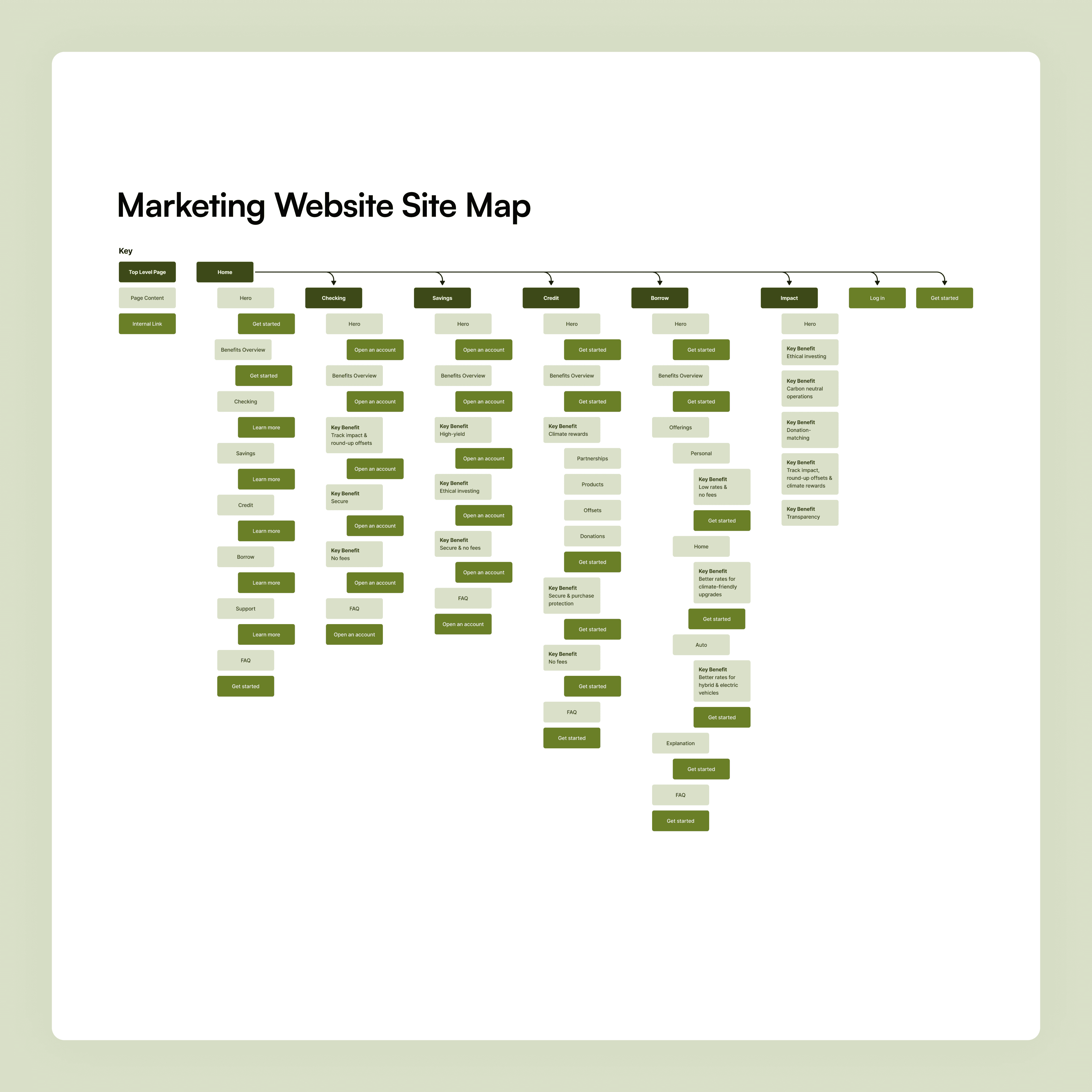

Site maps informed by user personas.
Keeping these personas in mind, I created site maps for both the marketing site and the customer-facing web app, focusing on clarity and satisfying user expectations.


Site maps informed by user personas.
Keeping these personas in mind, I created site maps for both the marketing site and the customer-facing web app, focusing on clarity and satisfying user expectations.


Site maps informed by user personas.
Next, I designed wireframes, prioritizing clear and beautiful data visualization.
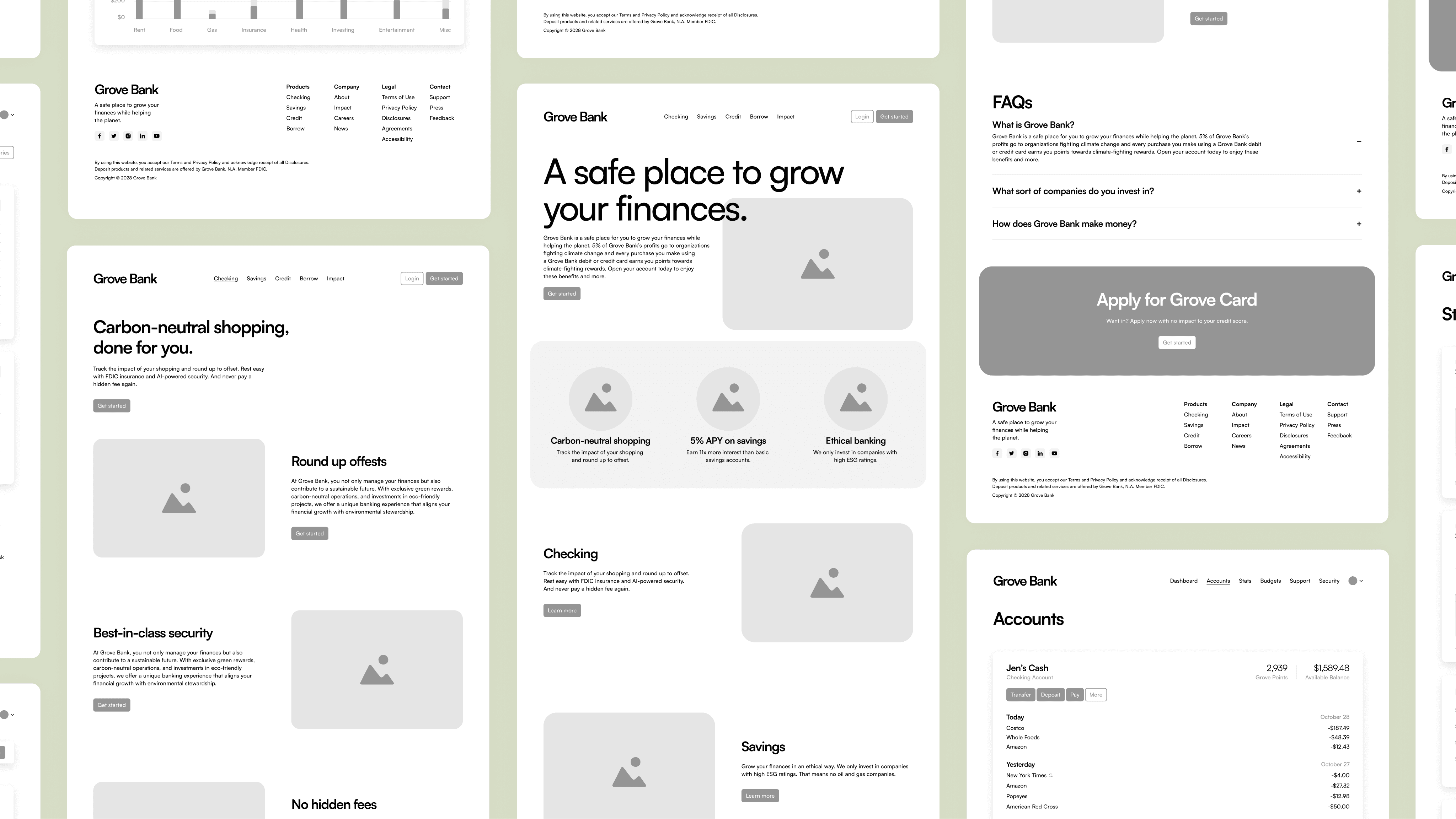
Wireframes for various pages.
Next, I designed wireframes, prioritizing clear and beautiful data visualization.

Wireframes for various pages.
Next, I designed wireframes, prioritizing clear and beautiful data visualization.

Wireframes for various pages.
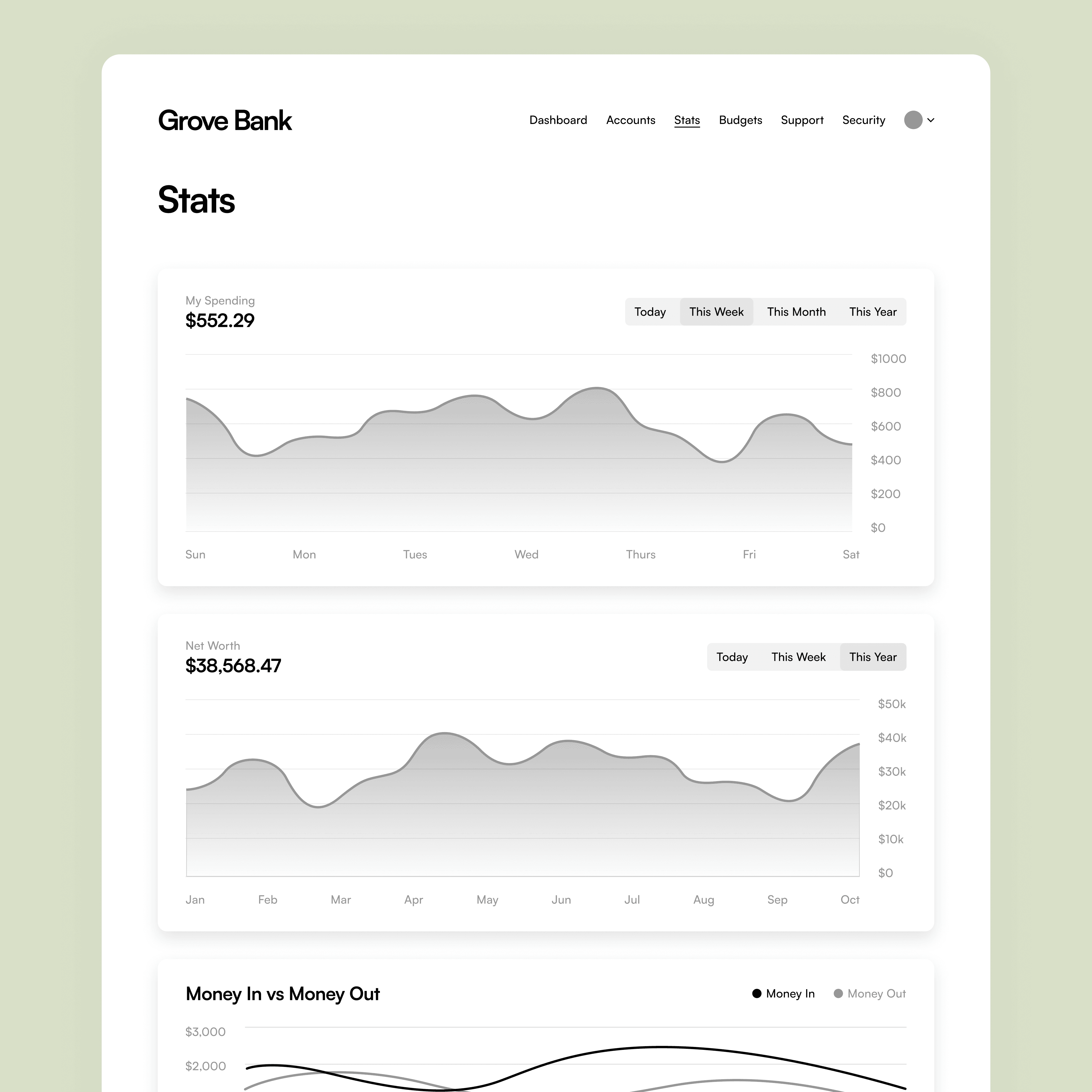
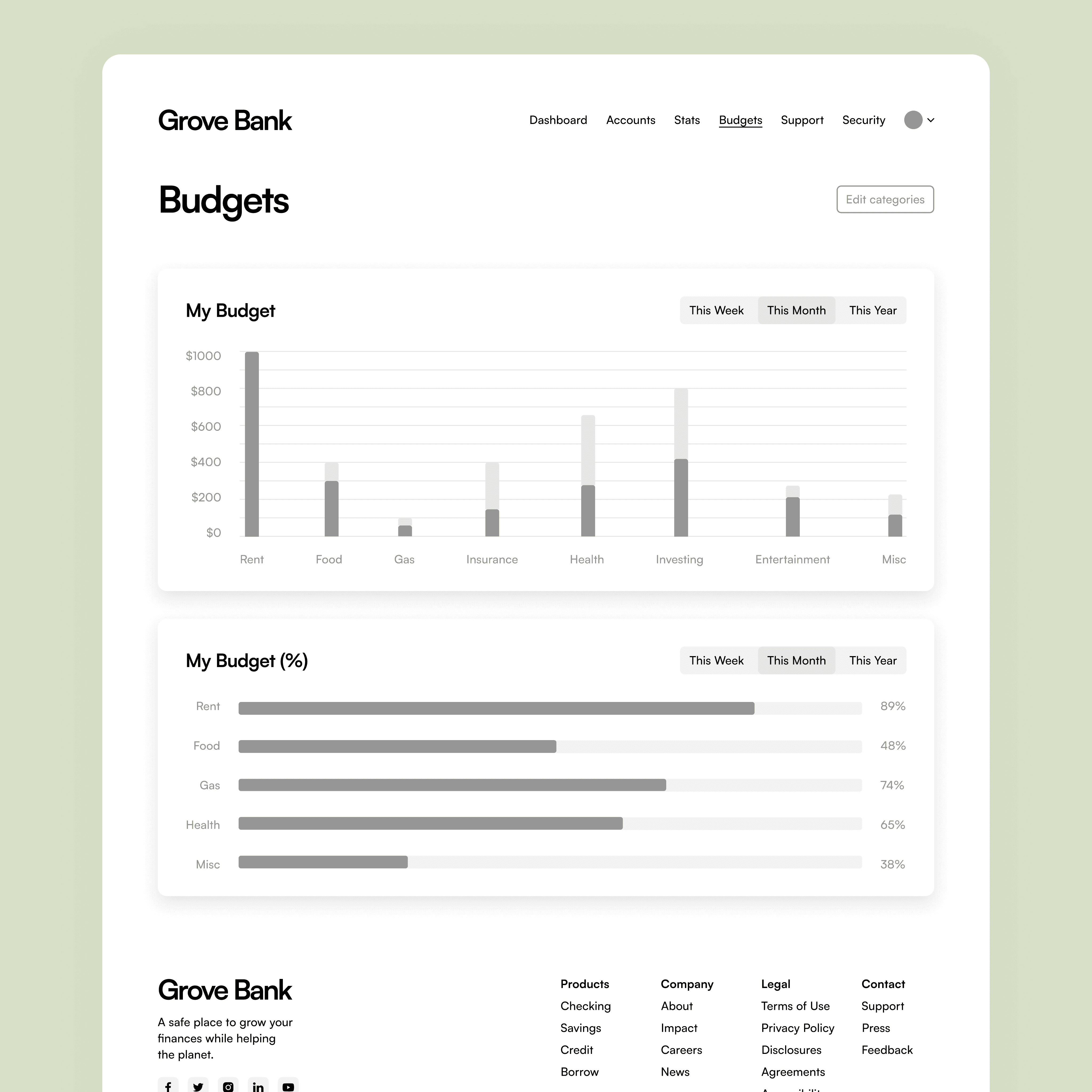
Wireframe for application stats page.
Wireframe for application budgets page.


Wireframe for application stats page.
Wireframe for application budgets page.


Wireframe for application stats page.
Wireframe for application budgets page.
Sprouting a Fresh Look
I wanted the UI to embody the unique ethos of Grove Bank: clean, natural, and beautiful.
For the primary color, I chose a warm green, reminiscent of plant leaves and American paper currency, to invoke feelings of calm and safety. After evaluating fourteen typeface options, I selected Satoshi, designed by Deni Anggara for the Indian Type Foundry, as Grove Bank’s primary typeface.
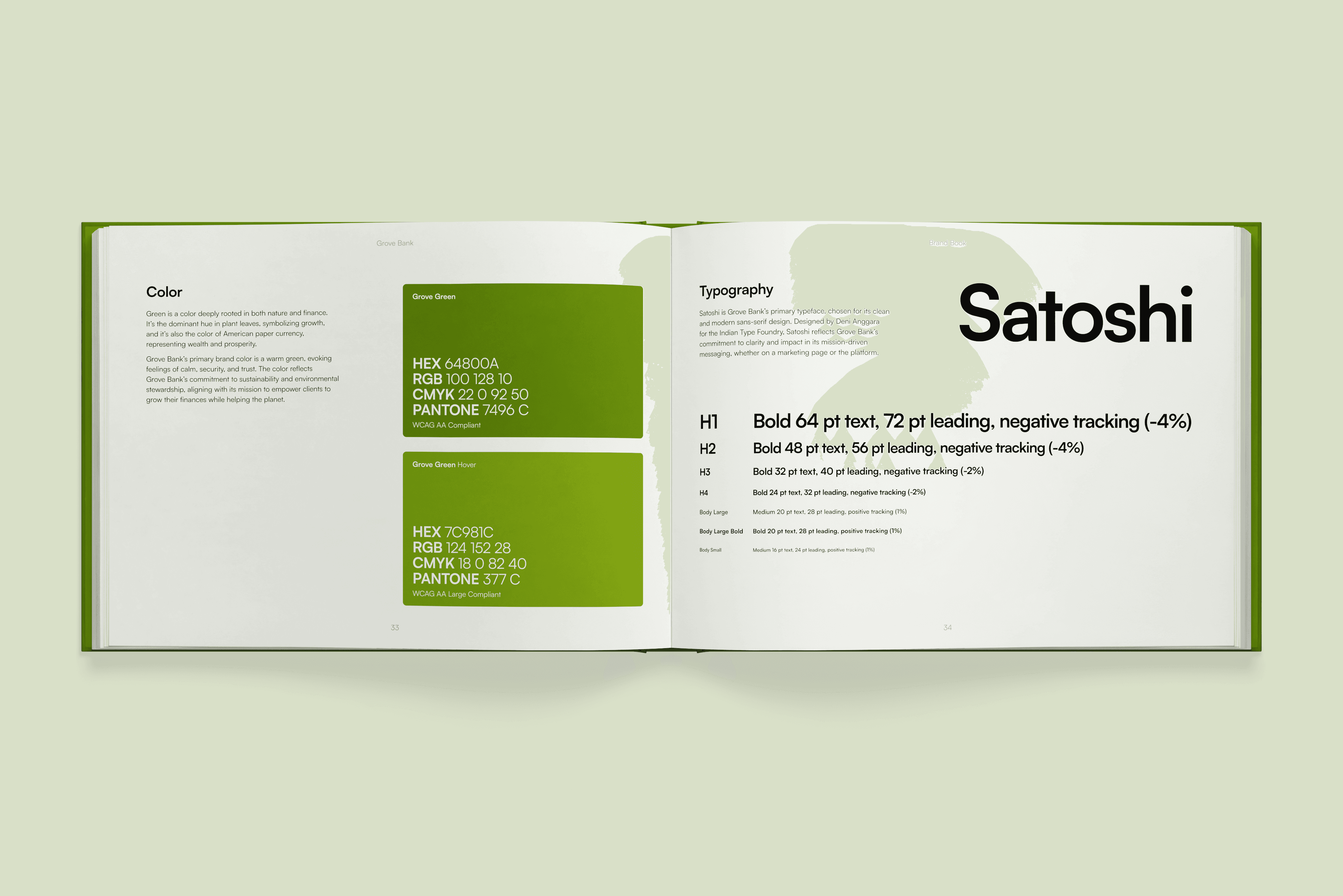
A selection from Grove Bank’s brand book.
Sprouting a Fresh Look
I wanted the UI to embody the unique ethos of Grove Bank: clean, natural, and beautiful.
For the primary color, I chose a warm green, reminiscent of plant leaves and American paper currency, to invoke feelings of calm and safety. After evaluating fourteen typeface options, I selected Satoshi, designed by Deni Anggara for the Indian Type Foundry, as Grove Bank’s primary typeface.

A selection from Grove Bank’s brand book.
Sprouting a Fresh Look
I wanted the UI to embody the unique ethos of Grove Bank: clean, natural, and beautiful.
For the primary color, I chose a warm green, reminiscent of plant leaves and American paper currency, to invoke feelings of calm and safety. After evaluating fourteen typeface options, I selected Satoshi, designed by Deni Anggara for the Indian Type Foundry, as Grove Bank’s primary typeface.

A selection from Grove Bank’s brand book.
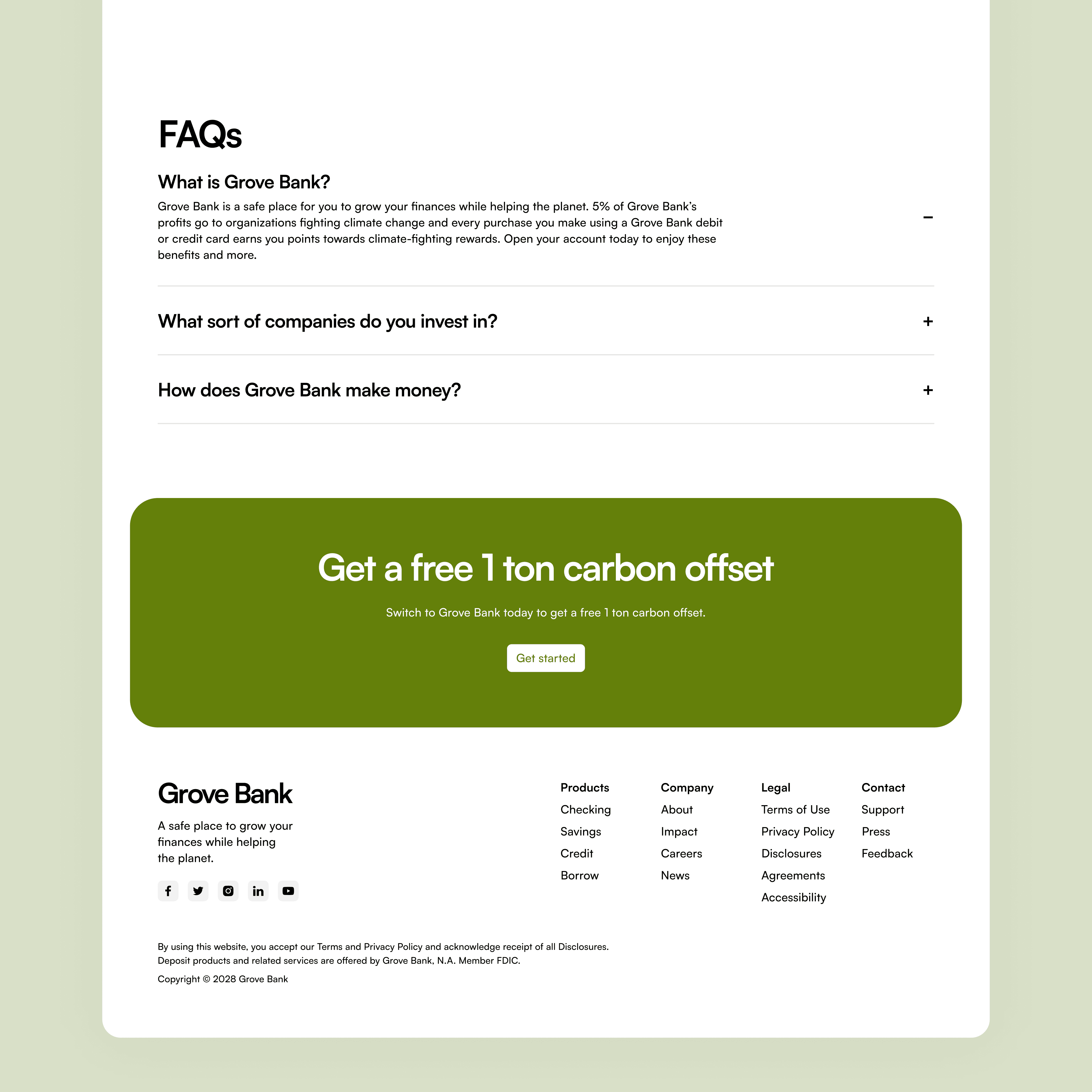
I then applied the branding to the UI and linked the pages to develop an interactive prototype.
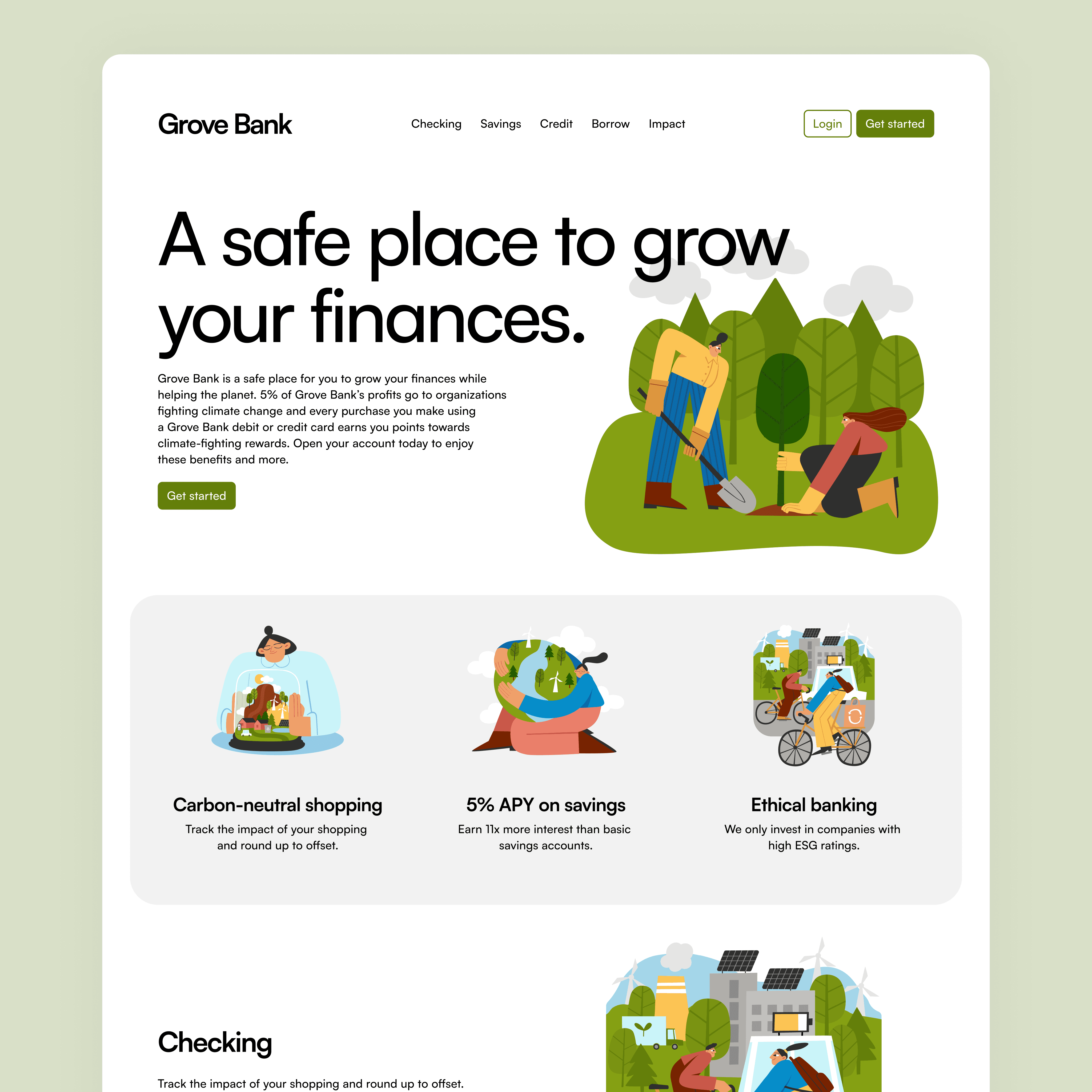
Marketing homepage hero, benefits, and product sections.
Marketing homepage FAQs, CTA, and footer sections.
I then applied the branding to the UI and linked the pages to develop an interactive prototype.


Marketing homepage hero, benefits, and product sections.
Marketing homepage FAQs, CTA, and footer sections.
I then applied the branding to the UI and linked the pages to develop an interactive prototype.


Marketing homepage hero, benefits, and product sections.
Marketing homepage FAQs, CTA, and footer sections.
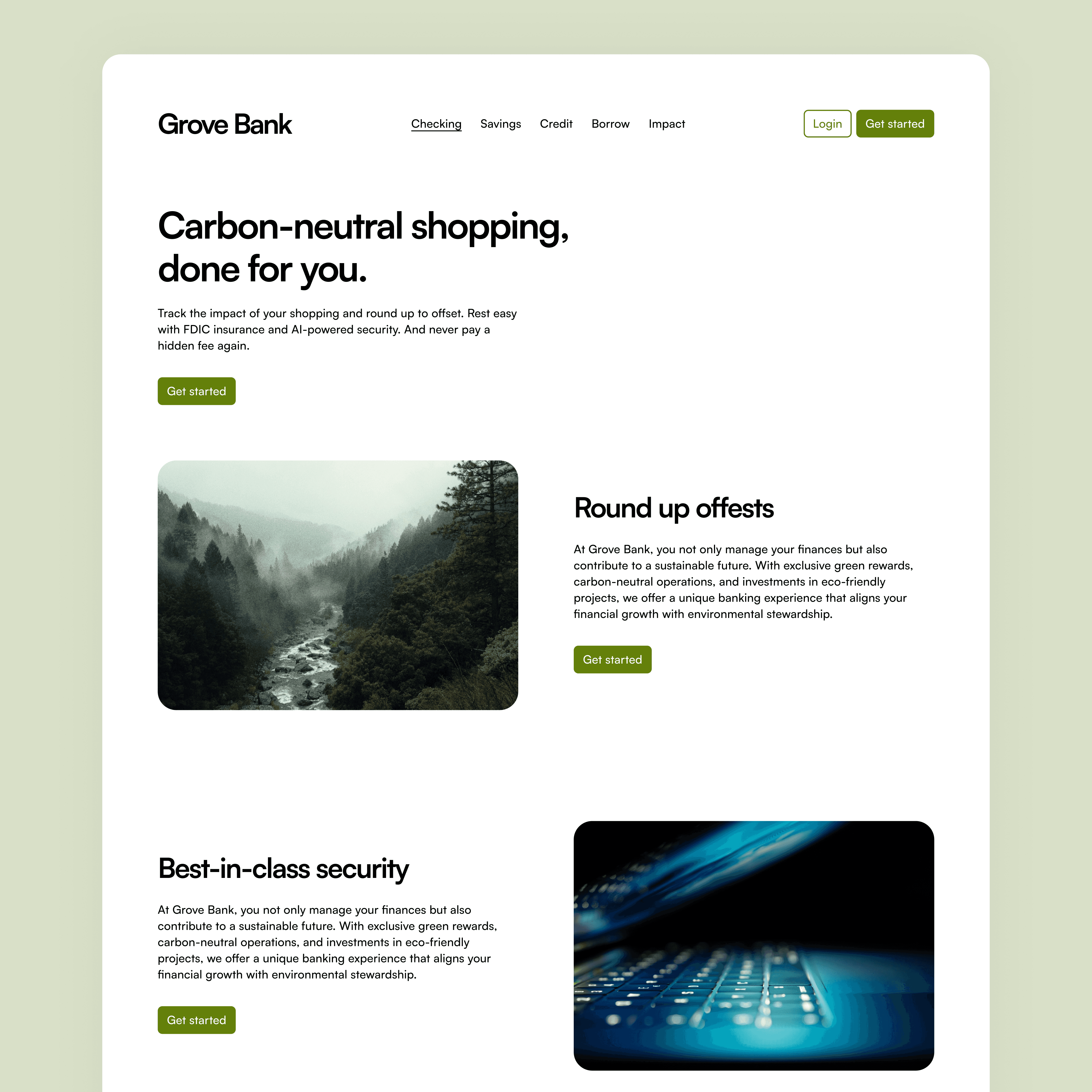
Marketing website checking account page.
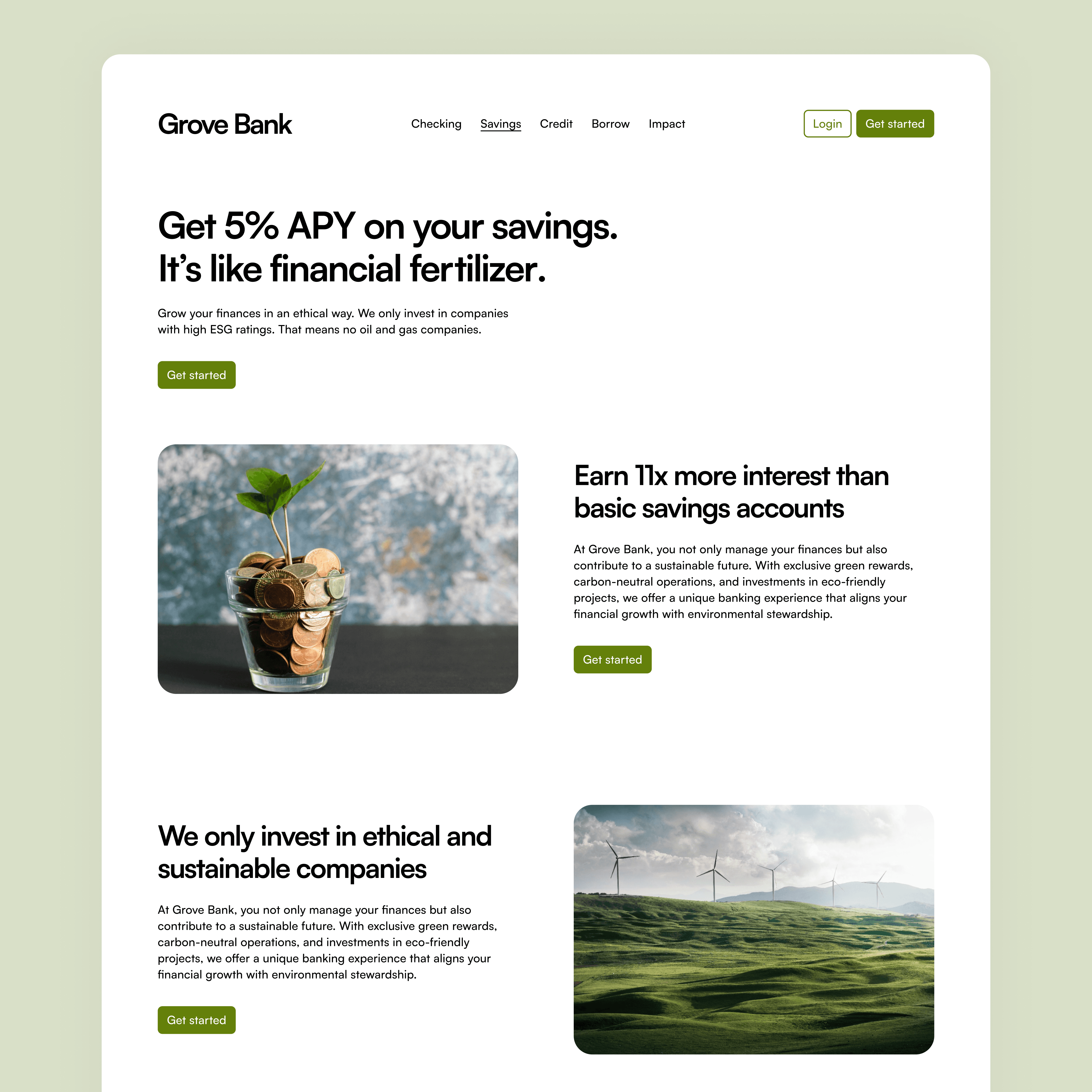
Marketing website savings account page.


Marketing website checking account page.
Marketing website savings account page.


Marketing website checking account page.
Marketing website savings account page.
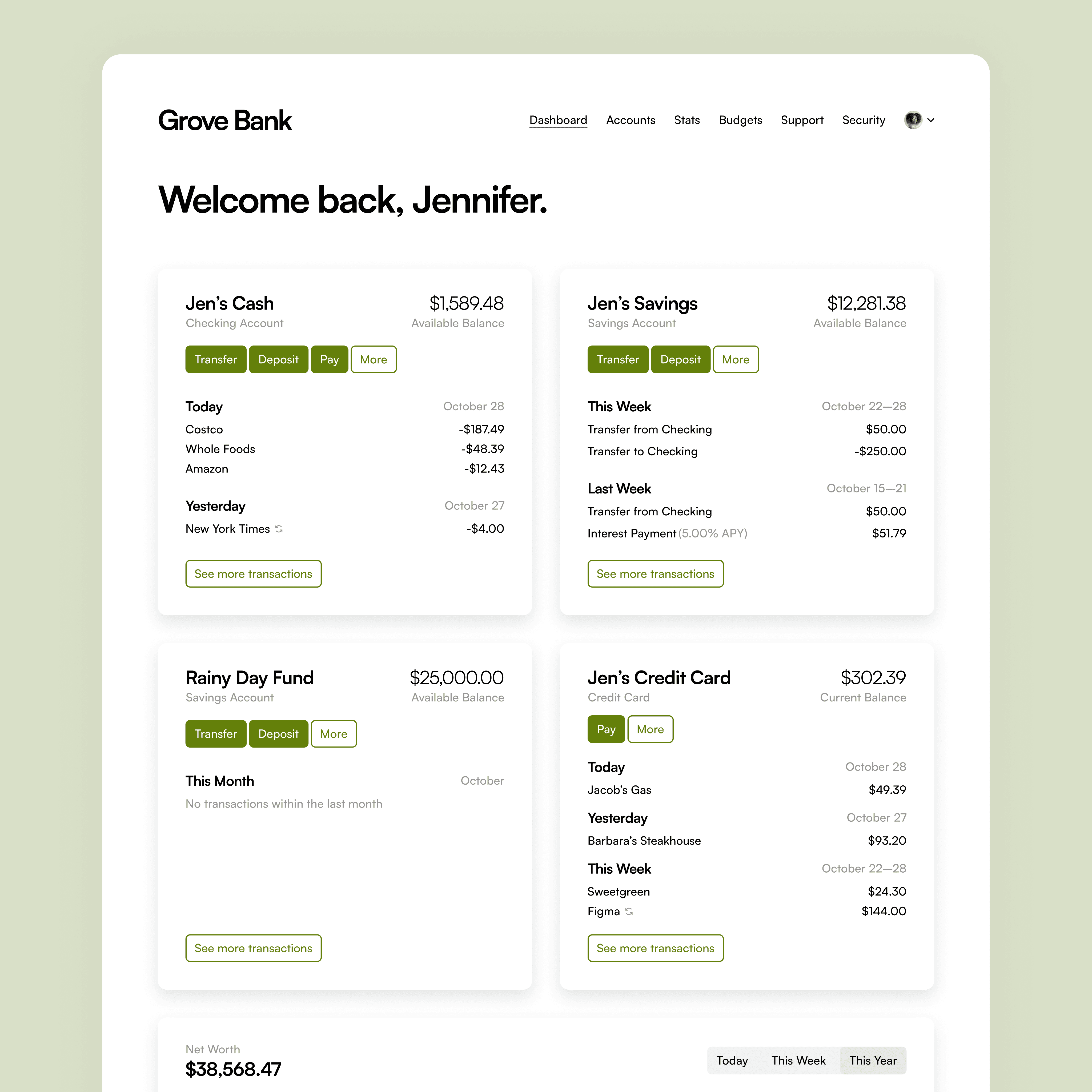
Application dashboard accounts overview.
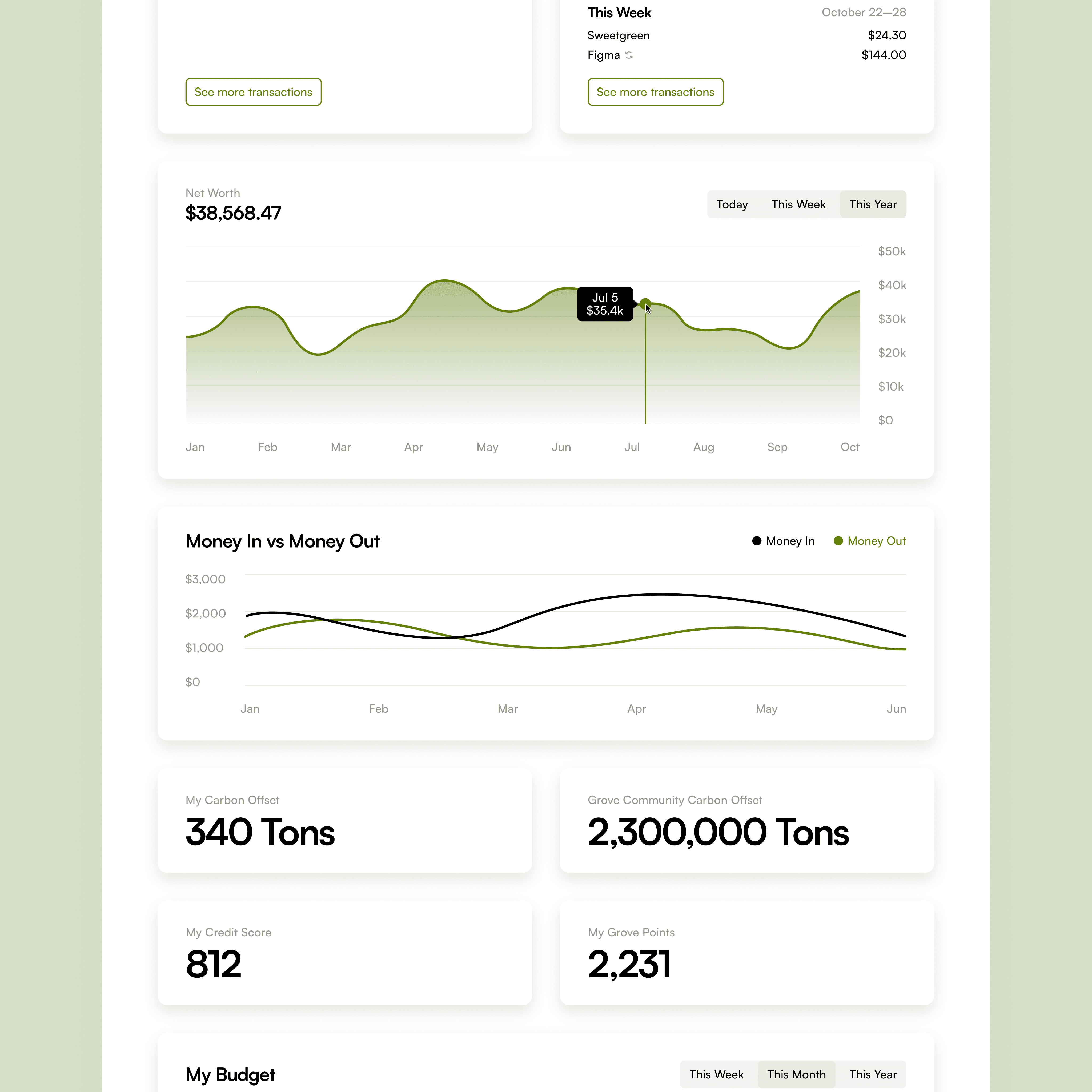
Application dashboard stats overview.


Application dashboard accounts overview.
Application dashboard stats overview.


Application dashboard accounts overview.
Application dashboard stats overview.
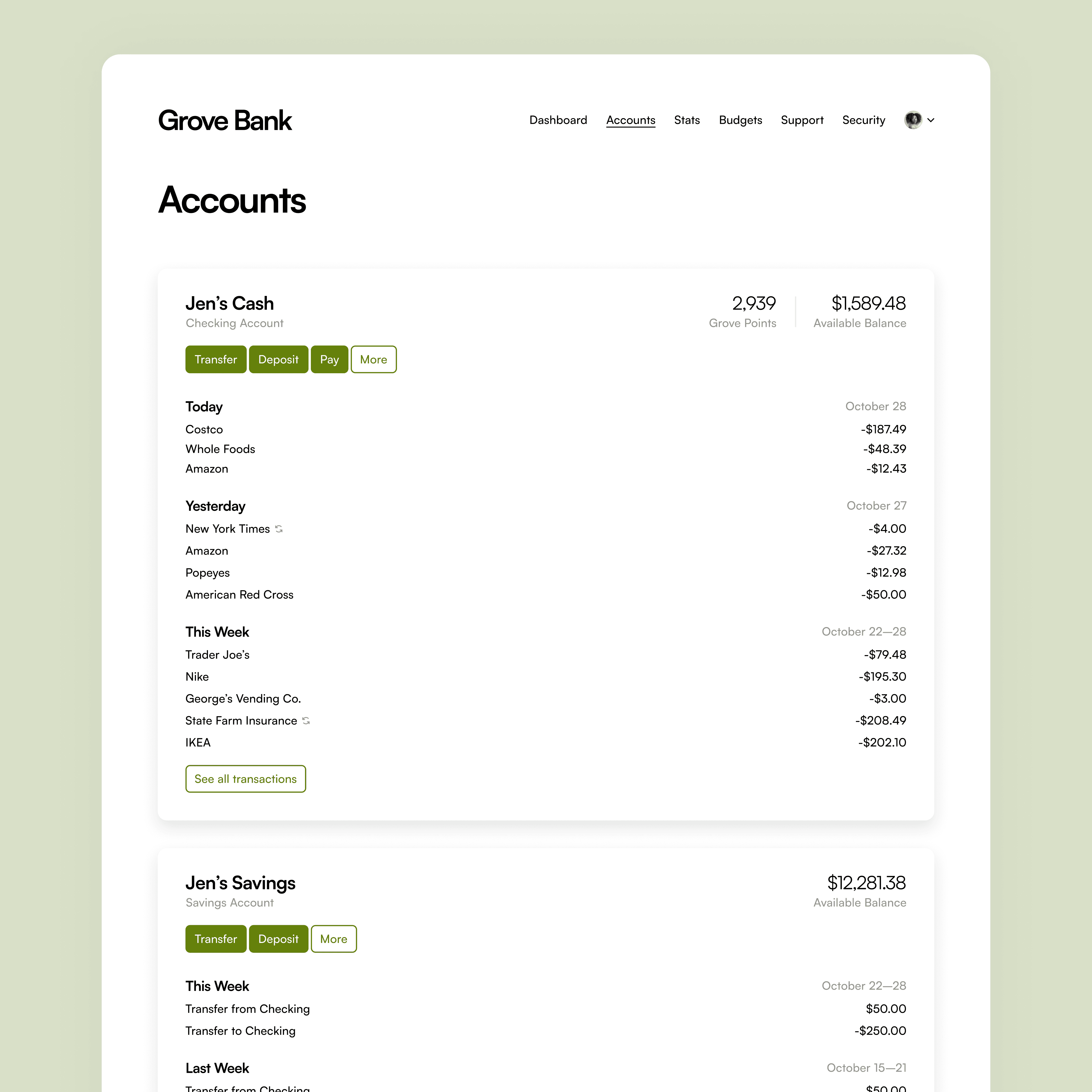
Application accounts page.
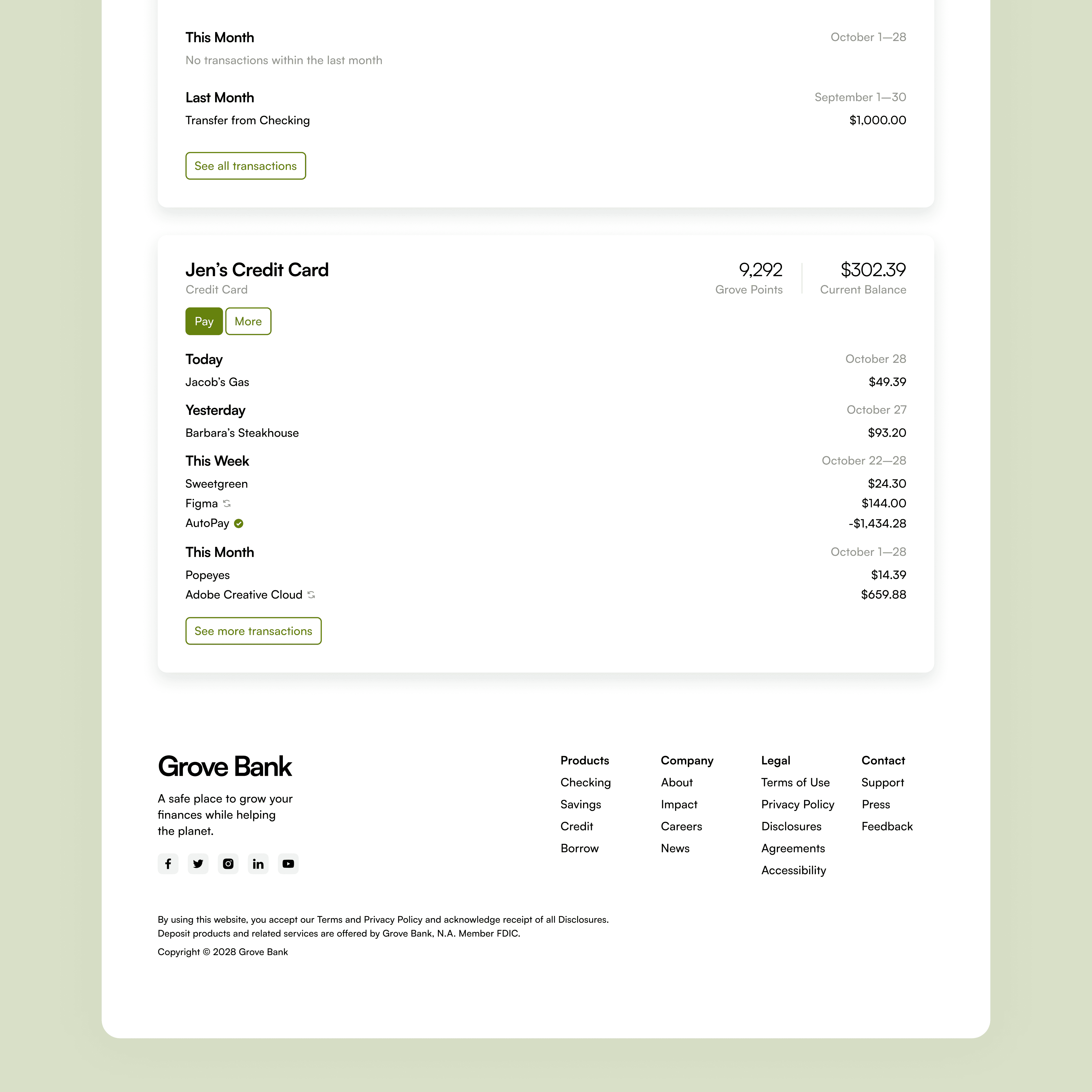
Application accounts page continued.


Application accounts page.
Application accounts page continued.


Application accounts page.
Application accounts page continued.
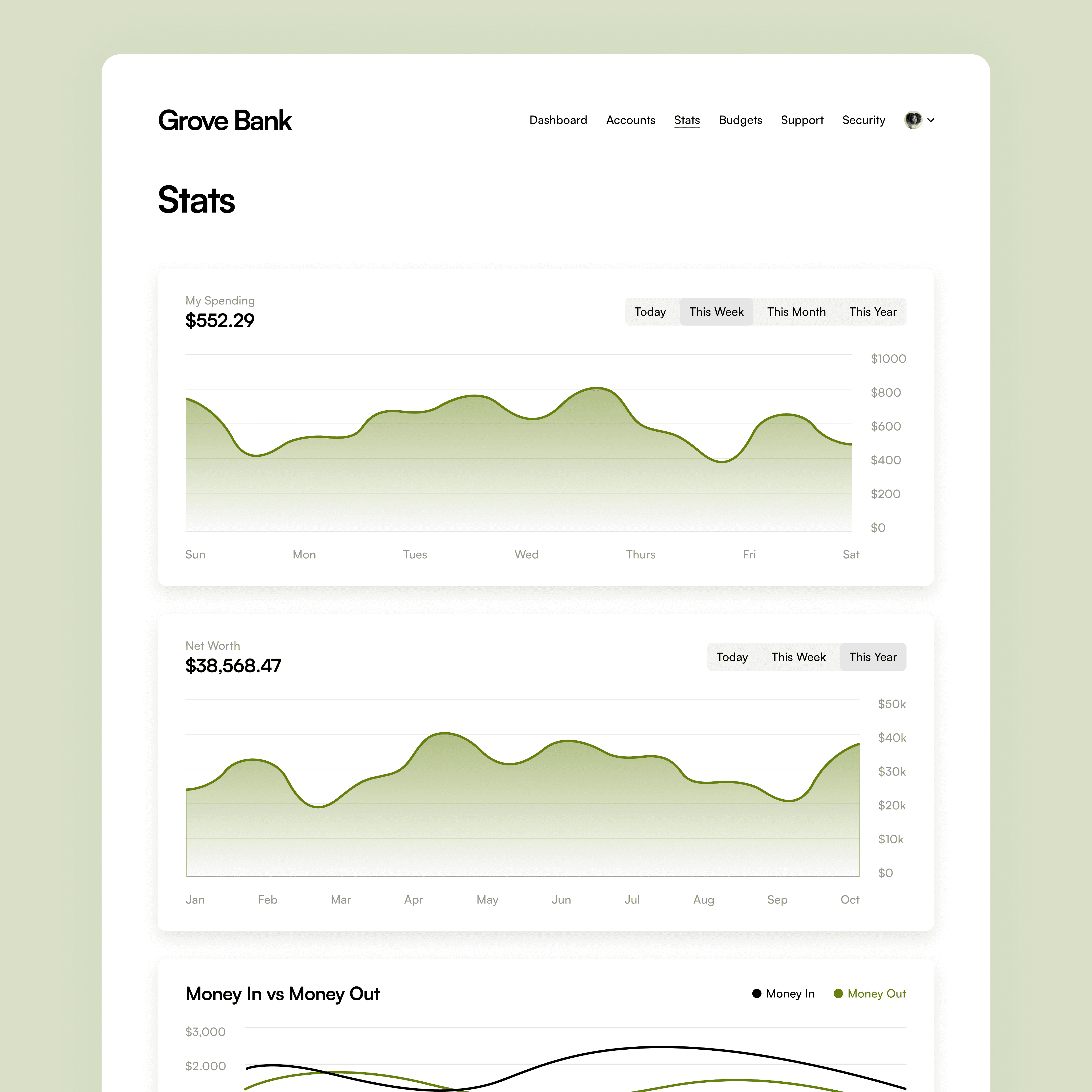
Application stats page.
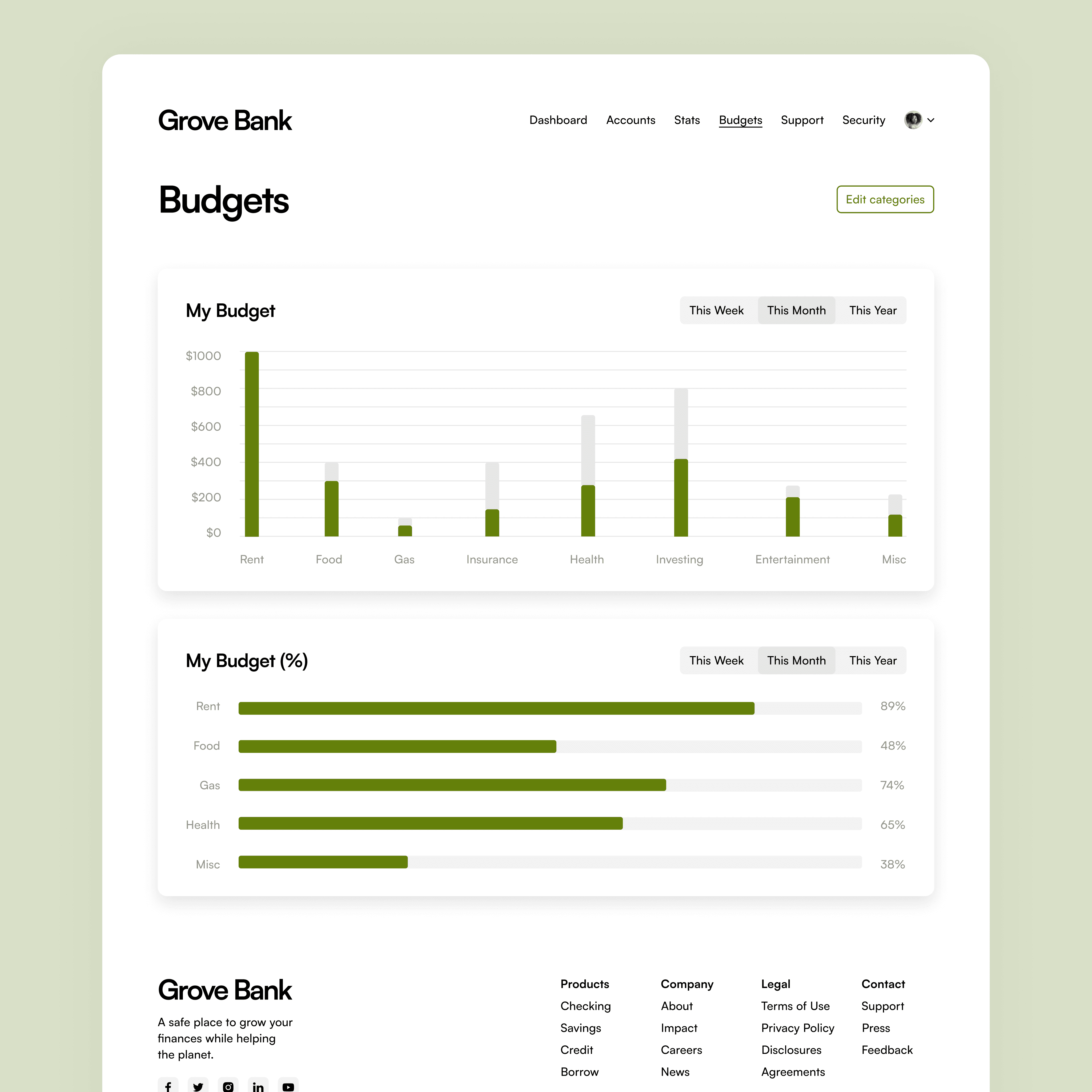
Application budgets page.


Application stats page.
Application budgets page.


Application stats page.
Application budgets page.
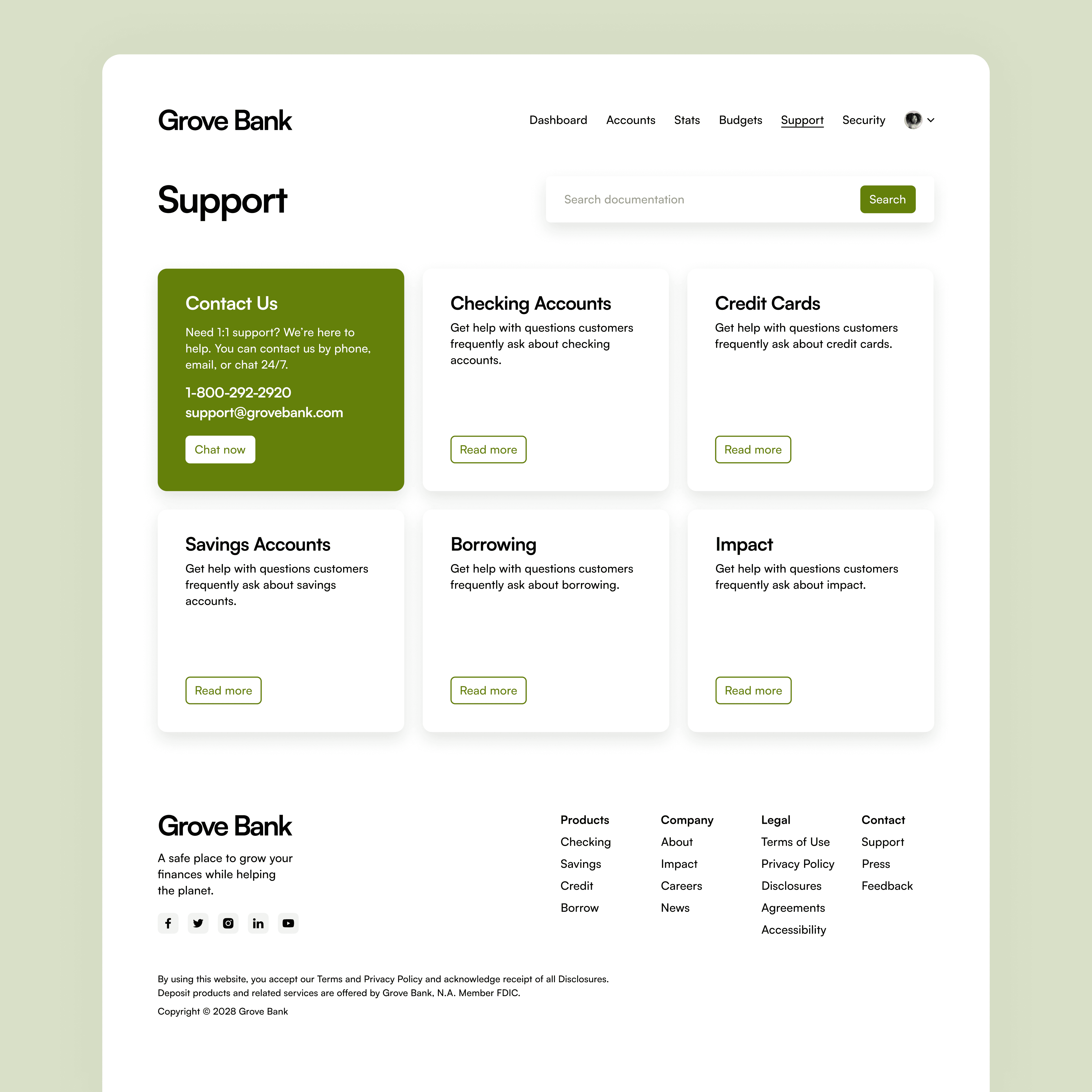
Application support page.
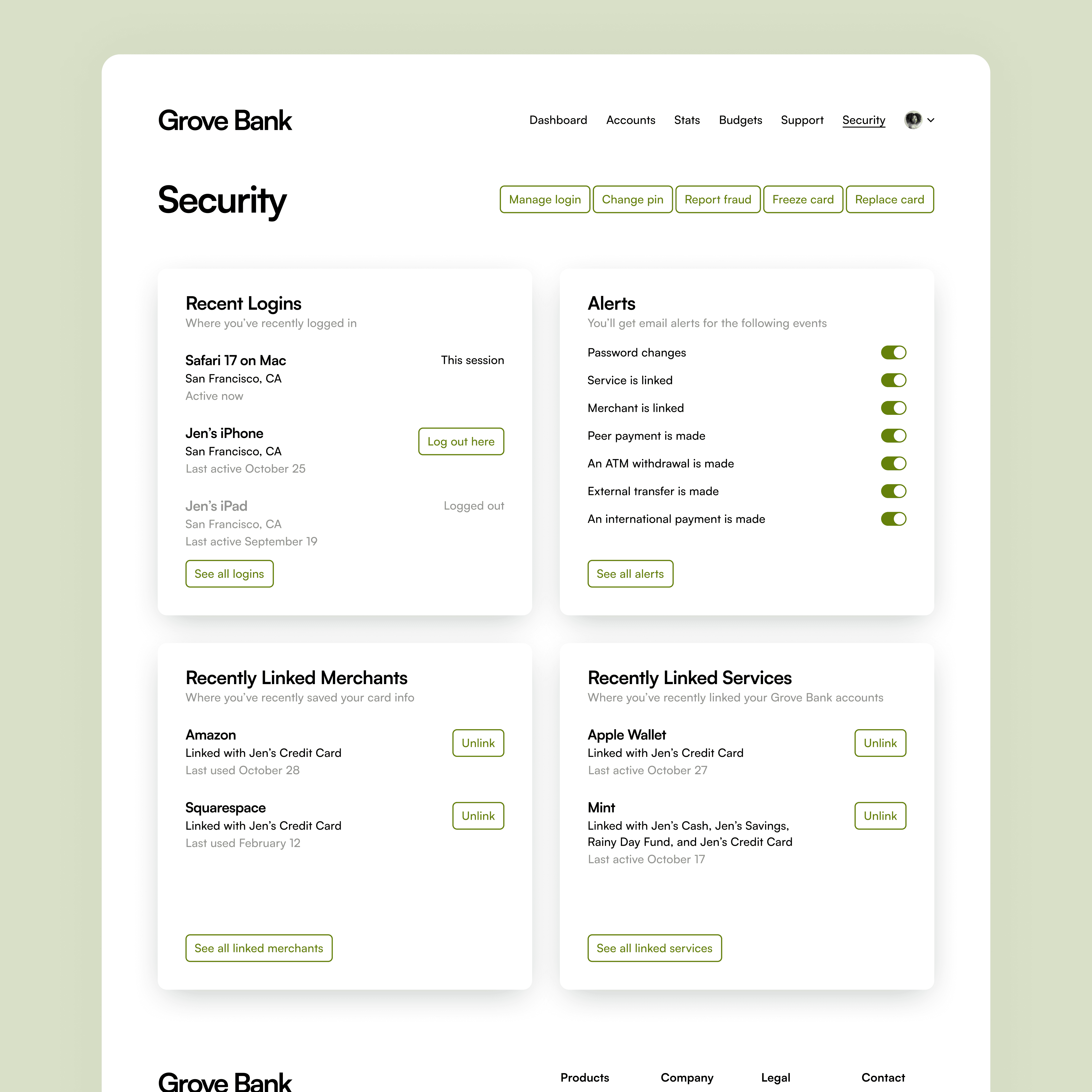
Application security page.


Application support page.
Application security page.


Application support page.
Application security page.
Harvesting Feedback
During the final critique, feedback from my peers and professor was quite positive. Many belonged to my target audience and validated both the concept and execution.
If I were to do this project again, I would balance the UX and UI design processes better. I spent 75% of my time on UX, which caused the quality of the UI to suffer. For instance, the marketing pages could have been more varied, and the data visualization could have been clearer. While UX is critical to business strategy, it’s also essential to devote time to crafting a fantastic UI.
Overall, I genuinely enjoyed working on this project. Grove Bank exemplifies my dedication to creating products that improve our planet, and I am excited about the prospect of developing more products like it.
Project Details
My Role
Creator UX Researcher UI Designer
Tools
Figma
Timeline
5 weeks
Related Work
© 2025 Max Stromfeld
All wrongs reserved
© 2025 Max Stromfeld
All wrongs reserved
© 2025 Max Stromfeld
All wrongs reserved

