GenFresh
GenFresh
GenFresh
For the best experience, please view project pages on a desktop or laptop computer.


Choosing an Issue to Slice
The brief from my professor was straightforward: design an iPhone app addressing a social, political, or environmental issue. The requirements included a splash screen, onboarding screens, and gamification across twelve or more screens. I had five weeks to deliver.
Reflecting on my lived experiences, passions, and the demand for a unique digital solution, I chose to tackle food insecurity.

Photos from Unsplash.
Choosing an Issue to Slice
The brief from my professor was straightforward: design an iPhone app addressing a social, political, or environmental issue. The requirements included a splash screen, onboarding screens, and gamification across twelve or more screens. I had five weeks to deliver.
Reflecting on my lived experiences, passions, and the demand for a unique digital solution, I chose to tackle food insecurity.

Photos from Unsplash.
Choosing an Issue to Slice
The brief from my professor was straightforward: design an iPhone app addressing a social, political, or environmental issue. The requirements included a splash screen, onboarding screens, and gamification across twelve or more screens. I had five weeks to deliver.
Reflecting on my lived experiences, passions, and the demand for a unique digital solution, I chose to tackle food insecurity.

Photos from Unsplash.
Crafting a Recipe for Understanding
Though I grew up food secure, I recognized the importance of understanding the challenges faced by those who were not. I was determined to create a solution that was both relevant and practical.
I consulted a Health and Human Services Eligibility Worker to understand the needs of her clients. I reviewed reports from the United Nations, the White House, and Harvard, and analyzed the landscape of existing digital solutions for food insecurity. I compiled my research on a FigJam board. By the end of the first week, I had gained deeper empathy for my intended audience and was ready to ideate potential solutions.
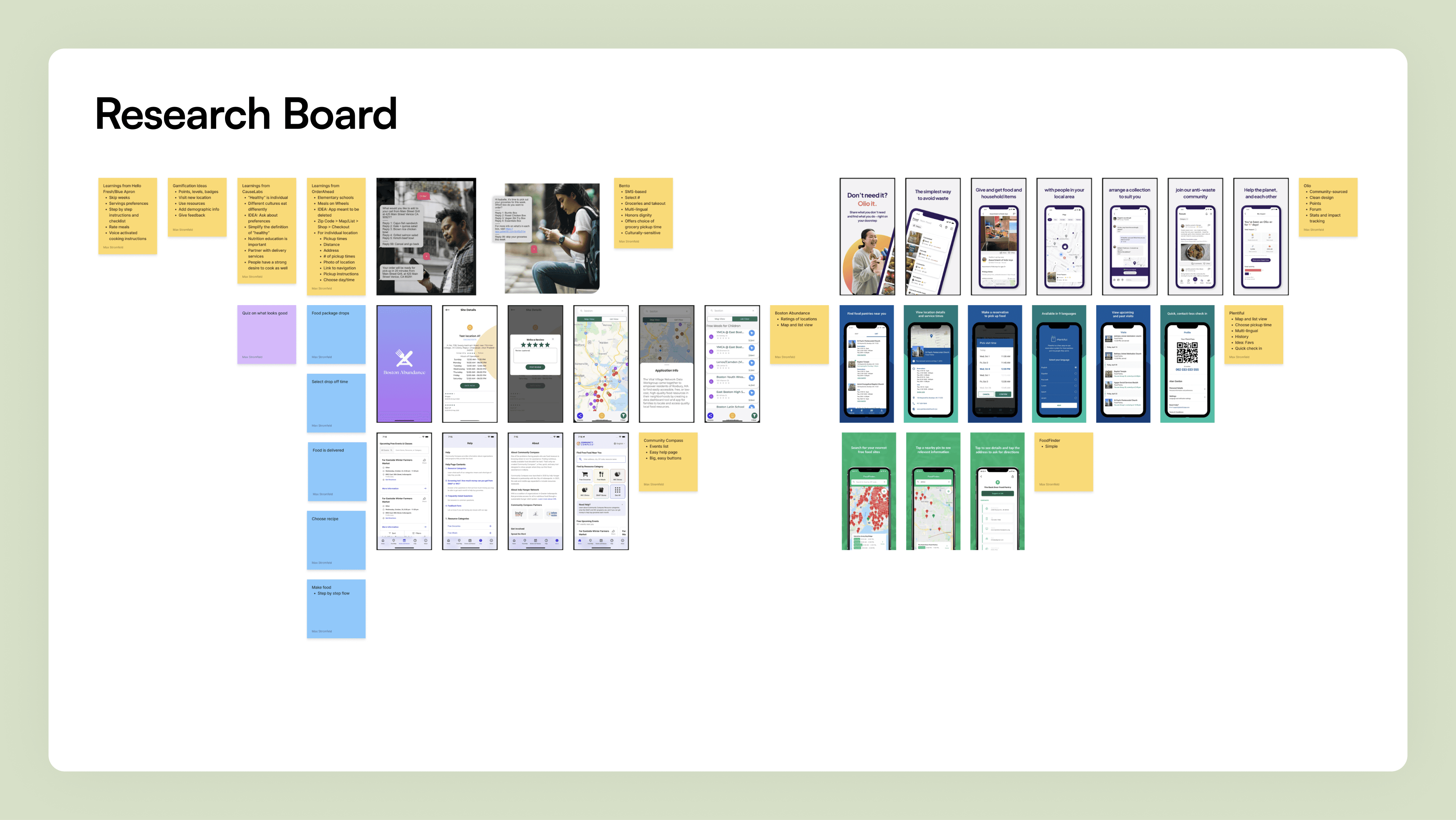
Research board created in FigJam.
Crafting a Recipe for Understanding
Though I grew up food secure, I recognized the importance of understanding the challenges faced by those who were not. I was determined to create a solution that was both relevant and practical.
I consulted a Health and Human Services Eligibility Worker to understand the needs of her clients. I reviewed reports from the United Nations, the White House, and Harvard, and analyzed the landscape of existing digital solutions for food insecurity. I compiled my research on a FigJam board. By the end of the first week, I had gained deeper empathy for my intended audience and was ready to ideate potential solutions.

Research board created in FigJam.
Crafting a Recipe for Understanding
Though I grew up food secure, I recognized the importance of understanding the challenges faced by those who were not. I was determined to create a solution that was both relevant and practical.
I consulted a Health and Human Services Eligibility Worker to understand the needs of her clients. I reviewed reports from the United Nations, the White House, and Harvard, and analyzed the landscape of existing digital solutions for food insecurity. I compiled my research on a FigJam board. By the end of the first week, I had gained deeper empathy for my intended audience and was ready to ideate potential solutions.

Research board created in FigJam.
Cooking Up a Hearty User Experience
I conceptualized an app providing free meal prep delivery to urban residents with low food security. The service would collect surplus food from local farmers (ensuring its freshness and reducing food waste) and deliver it to participants. The app would also provide personalized recipes and nutrition education, empowering users to make healthy choices.
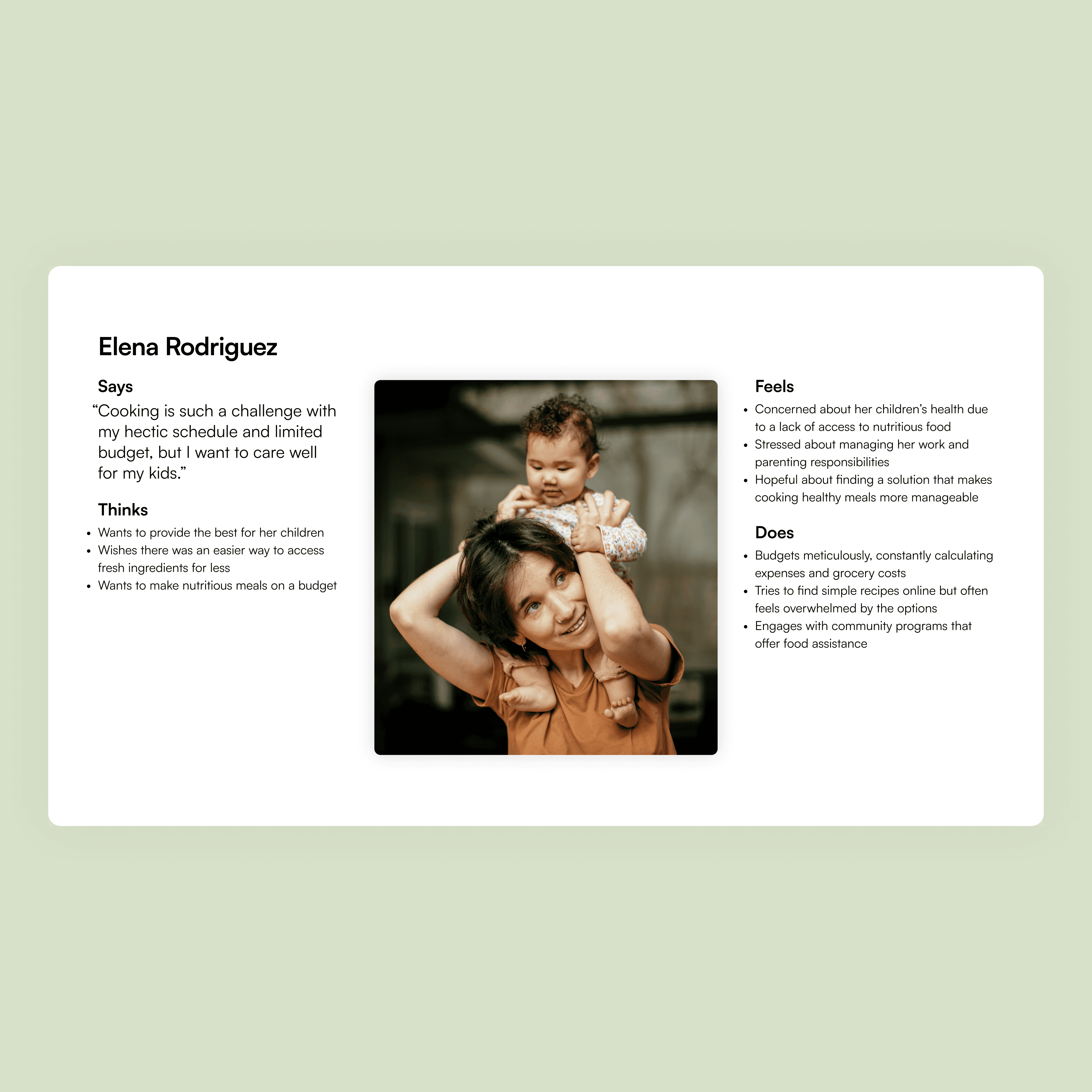
After consulting the Eligibility Worker and validating my concept with the research, I developed user personas and empathy maps. I then moved on to developing the information architecture.
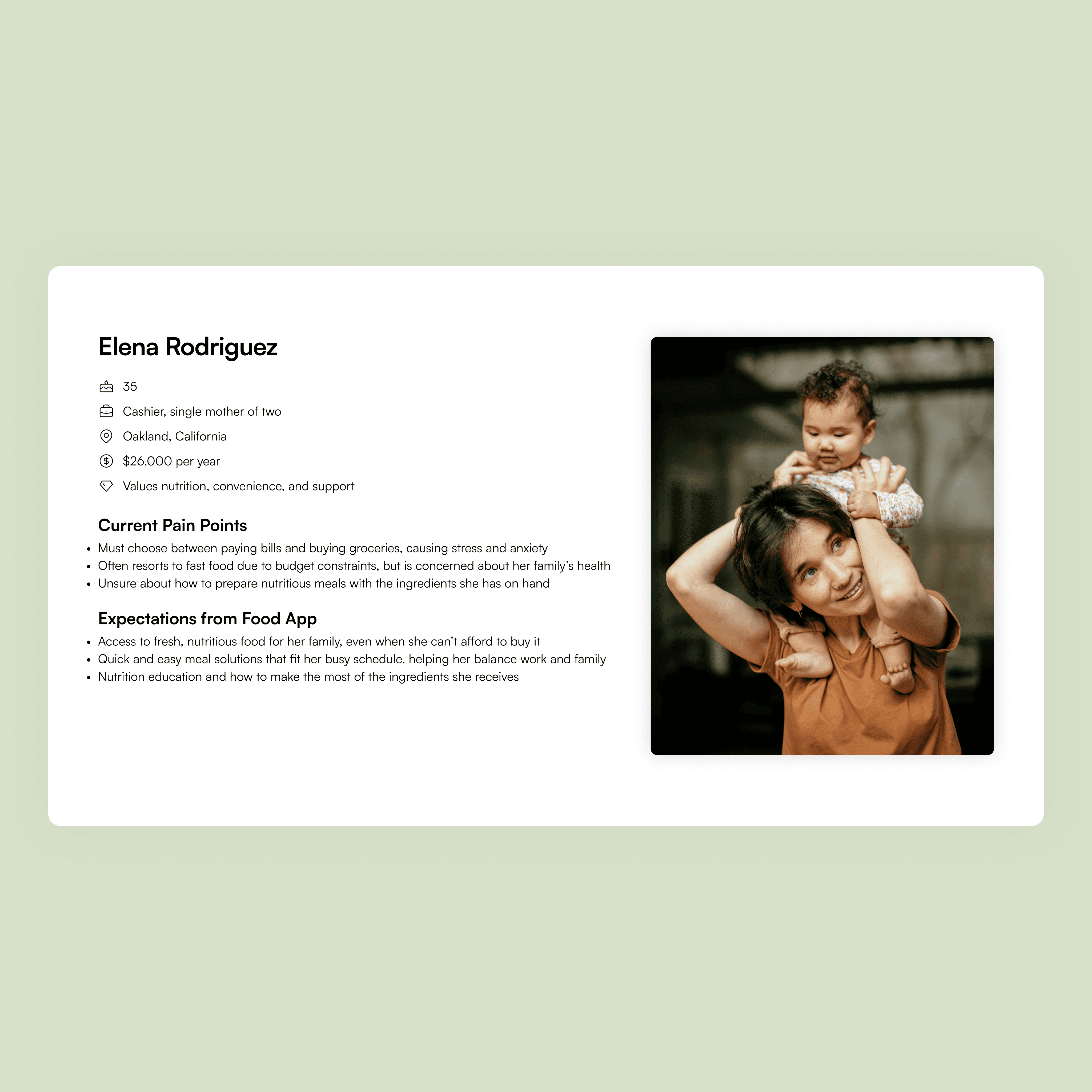
User persona reflecting my target audience.
Empathy map reflecting my target audience.
Cooking Up a Hearty User Experience
I conceptualized an app providing free meal prep delivery to urban residents with low food security. The service would collect surplus food from local farmers (ensuring its freshness and reducing food waste) and deliver it to participants. The app would also provide personalized recipes and nutrition education, empowering users to make healthy choices.
After consulting the Eligibility Worker and validating my concept with the research, I developed user personas and empathy maps. I then moved on to developing the information architecture.


User persona reflecting my target audience.
Empathy map reflecting my target audience.
Cooking Up a Hearty User Experience
I conceptualized an app providing free meal prep delivery to urban residents with low food security. The service would collect surplus food from local farmers (ensuring its freshness and reducing food waste) and deliver it to participants. The app would also provide personalized recipes and nutrition education, empowering users to make healthy choices.
After consulting the Eligibility Worker and validating my concept with the research, I developed user personas and empathy maps. I then moved on to developing the information architecture.


User persona reflecting my target audience.
Empathy map reflecting my target audience.
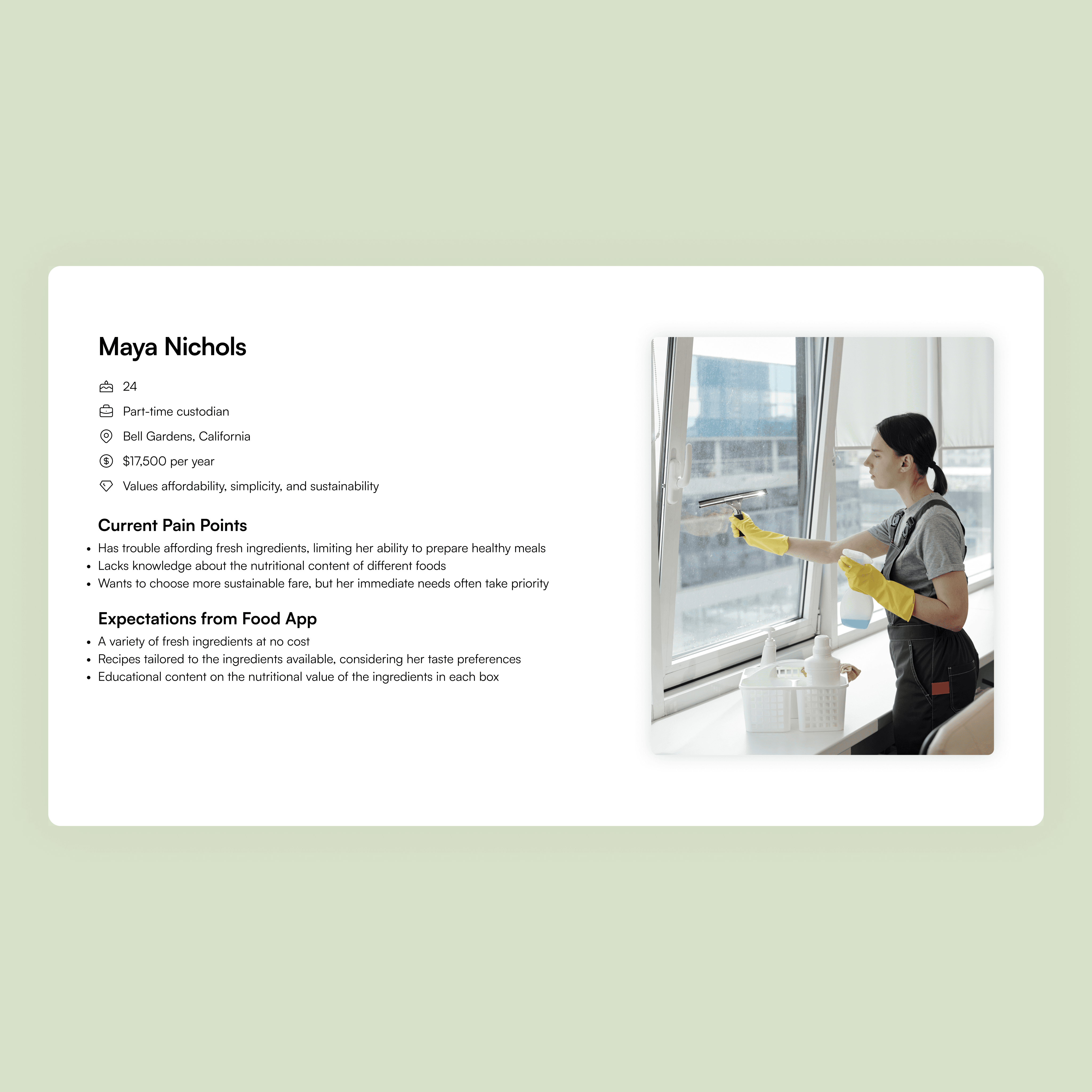
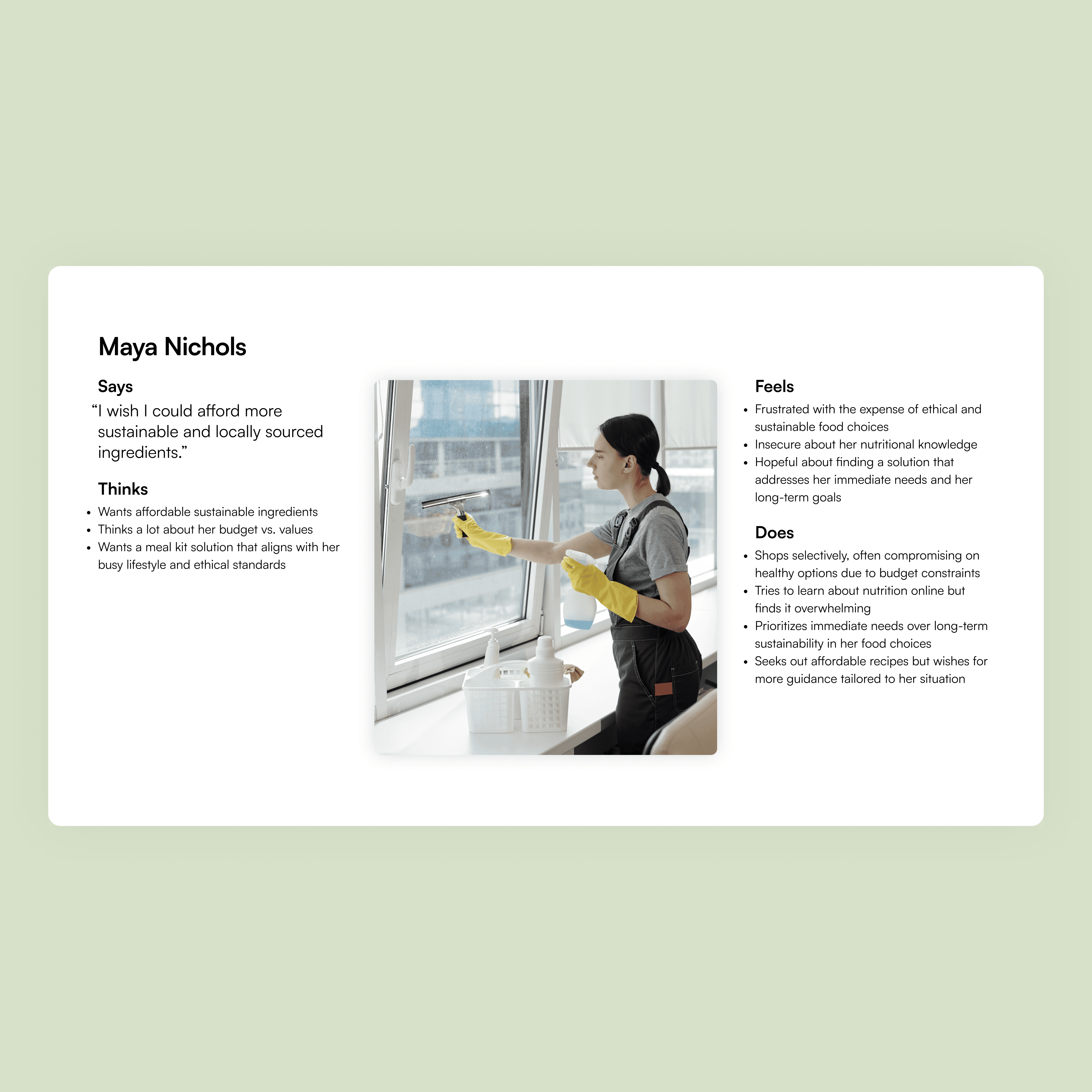
User persona reflecting my target audience.
Empathy map reflecting my target audience.


User persona reflecting my target audience.
Empathy map reflecting my target audience.


User persona reflecting my target audience.
Empathy map reflecting my target audience.
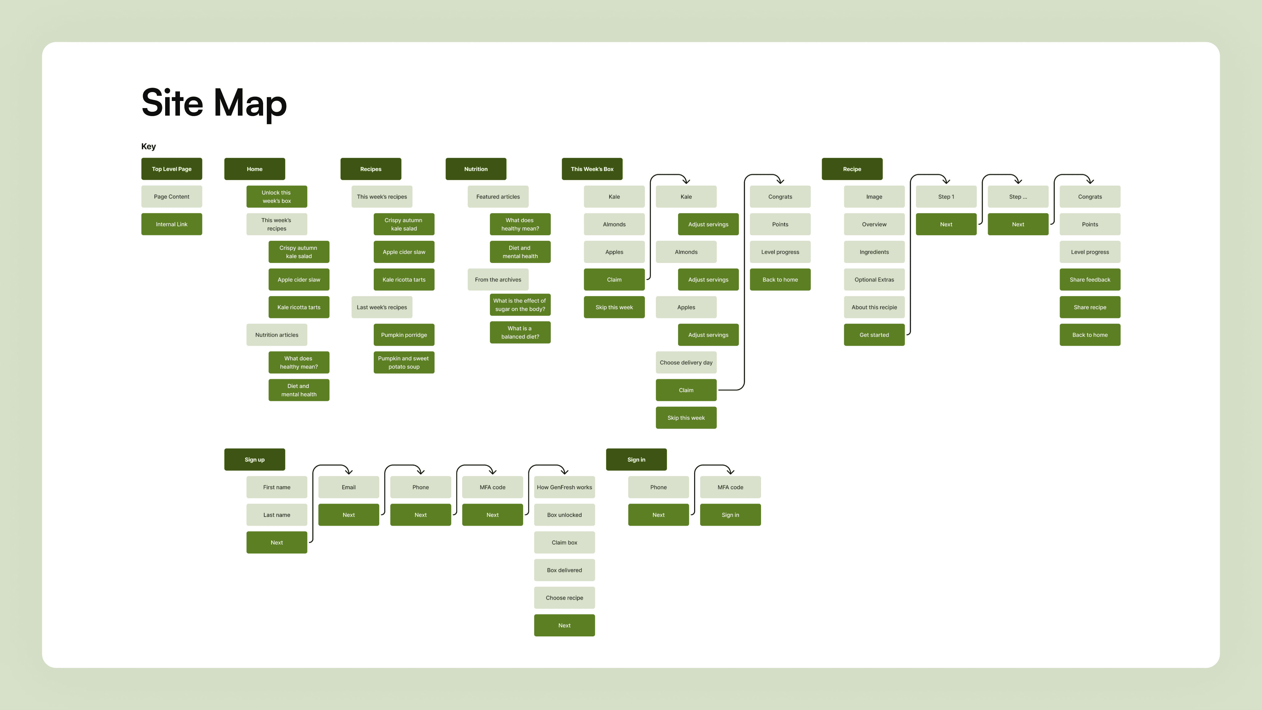
Site map created in FigJam.

Site map created in FigJam.

Site map created in FigJam.
The sitemap came together quickly, followed by wireframes. I consulted my comparative analysis to identify strengths and areas for improvement. While HelloFresh and Blue Apron excelled in food photography, I noted they could improve space utilization and content differentiation. The apps focused on ending food insecurity had significant room for improvement.
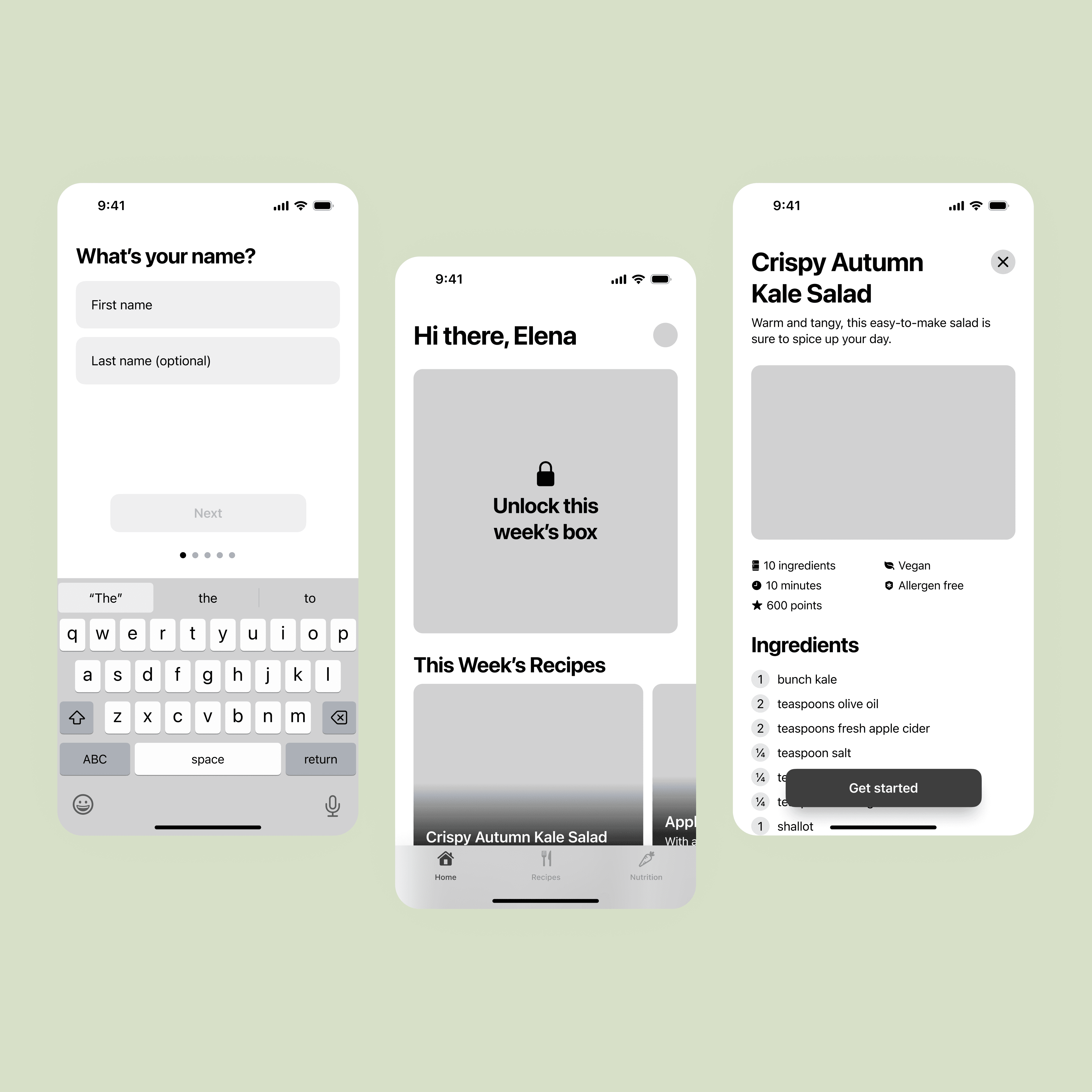
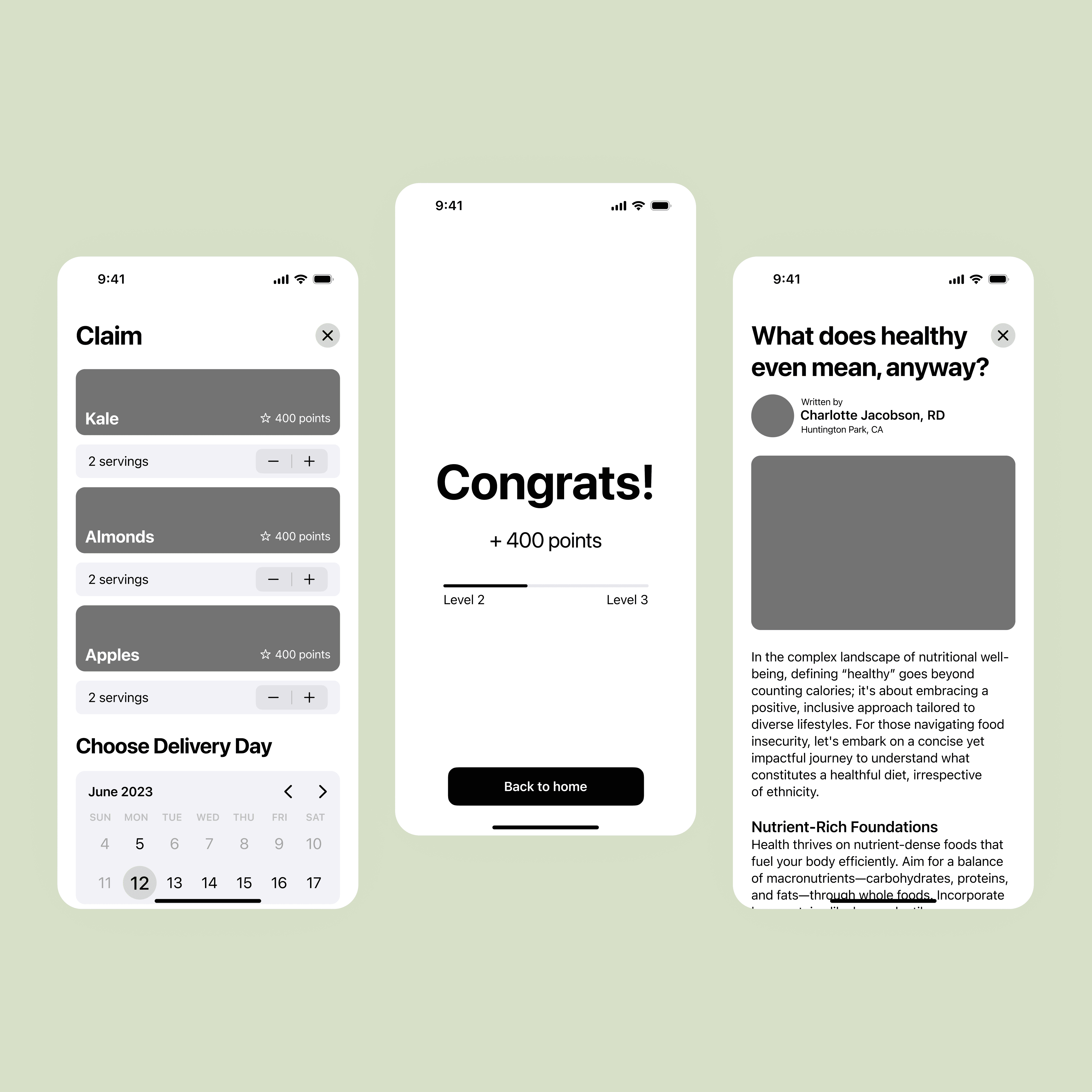
Various wireframes.
The sitemap came together quickly, followed by wireframes. I consulted my comparative analysis to identify strengths and areas for improvement. While HelloFresh and Blue Apron excelled in food photography, I noted they could improve space utilization and content differentiation. The apps focused on ending food insecurity had significant room for improvement.


Various wireframes.
The sitemap came together quickly, followed by wireframes. I consulted my comparative analysis to identify strengths and areas for improvement. While HelloFresh and Blue Apron excelled in food photography, I noted they could improve space utilization and content differentiation. The apps focused on ending food insecurity had significant room for improvement.


Various wireframes.
After developing the wireframes, I conducted user testing with my peers and professor. Their feedback was invaluable in improving the flow and intuitiveness of the app. Ideally, I would have tested the app with my intended audience, but I opted to skip that step due to time constraints and the project’s conceptual nature.
After developing the wireframes, I conducted user testing with my peers and professor. Their feedback was invaluable in improving the flow and intuitiveness of the app. Ideally, I would have tested the app with my intended audience, but I opted to skip that step due to time constraints and the project’s conceptual nature.
After developing the wireframes, I conducted user testing with my peers and professor. Their feedback was invaluable in improving the flow and intuitiveness of the app. Ideally, I would have tested the app with my intended audience, but I opted to skip that step due to time constraints and the project’s conceptual nature.
Perfecting the Palette
With the wireframes complete, I added colors, images, and flair to the user interface. I prioritized beautiful food photography to make the app feel upscale and employed two contrasting brand colors: neon and calming green.
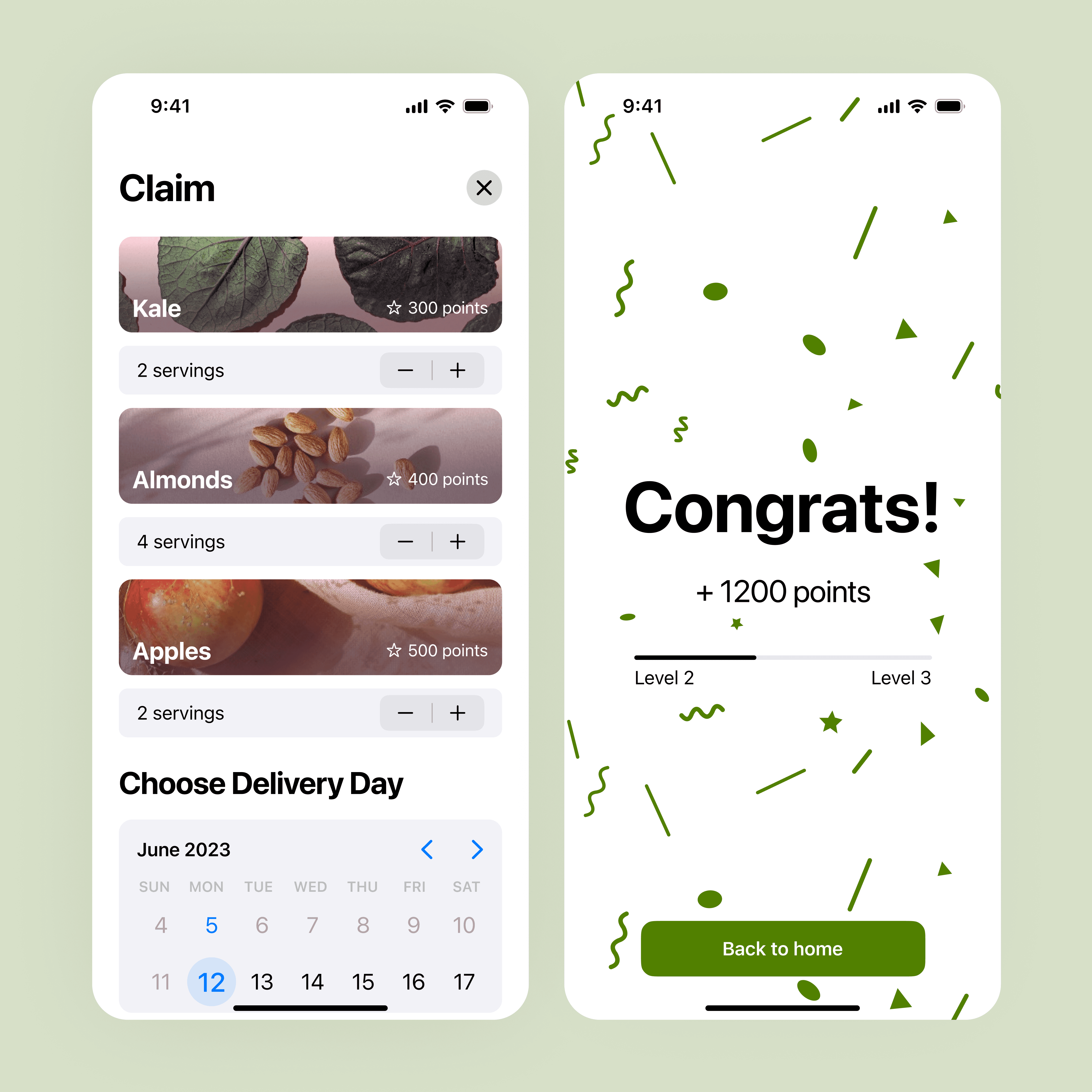
Splash screen and home tab.
Claim ingredients to get points.
Perfecting the Palette
With the wireframes complete, I added colors, images, and flair to the user interface. I prioritized beautiful food photography to make the app feel upscale and employed two contrasting brand colors: neon and calming green.

Splash screen and home tab.
Claim ingredients to get points.
Perfecting the Palette
With the wireframes complete, I added colors, images, and flair to the user interface. I prioritized beautiful food photography to make the app feel upscale and employed two contrasting brand colors: neon and calming green.

Splash screen and home tab.
Claim ingredients to get points.


Recipes tab and recipe overview.
Tap unique terms to see definitions.


Recipes tab and recipe overview.
Tap unique terms to see definitions.


Recipes tab and recipe overview.
Tap unique terms to see definitions.
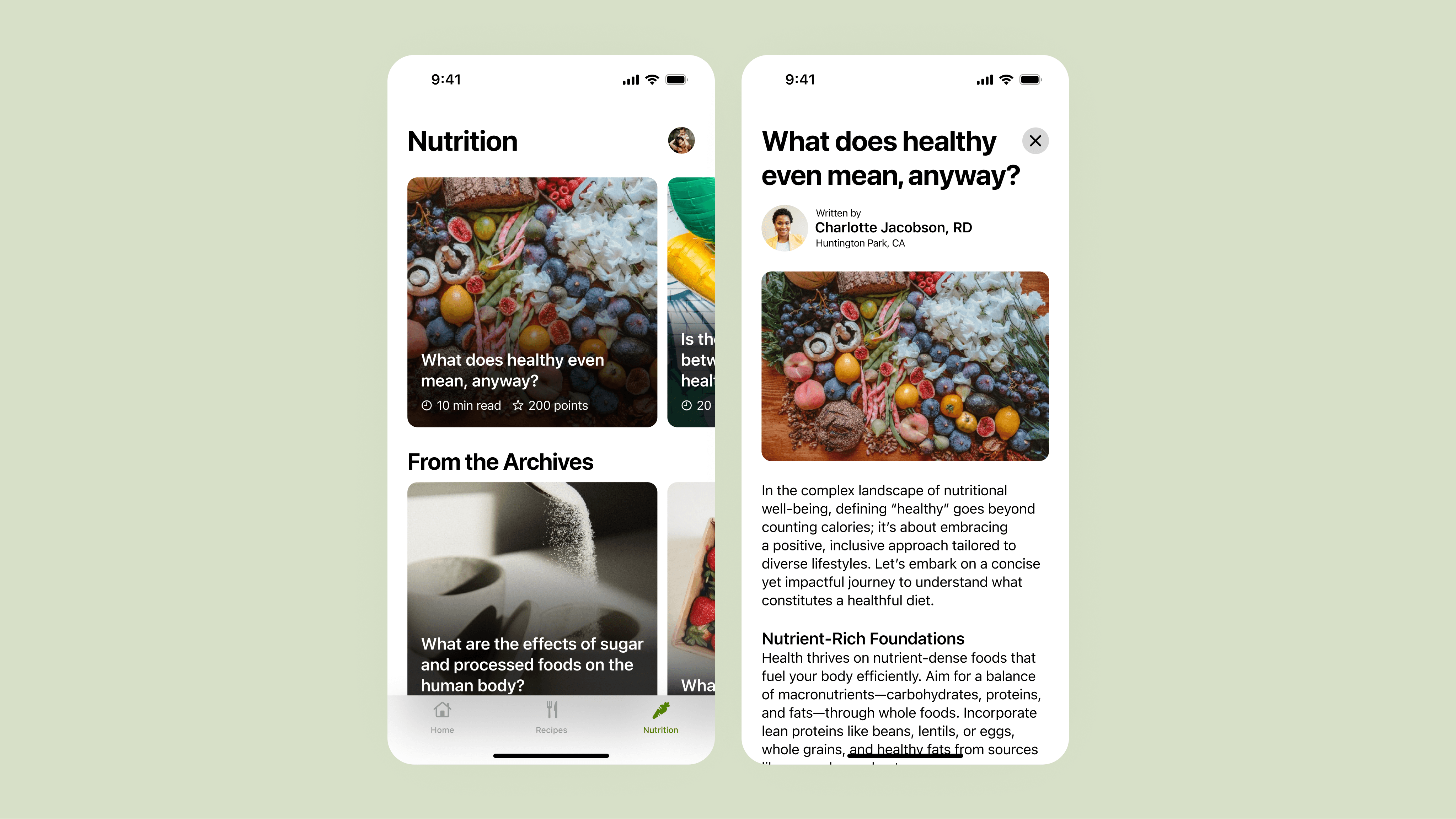
Nutrition tab and article.

Nutrition tab and article.

Nutrition tab and article.
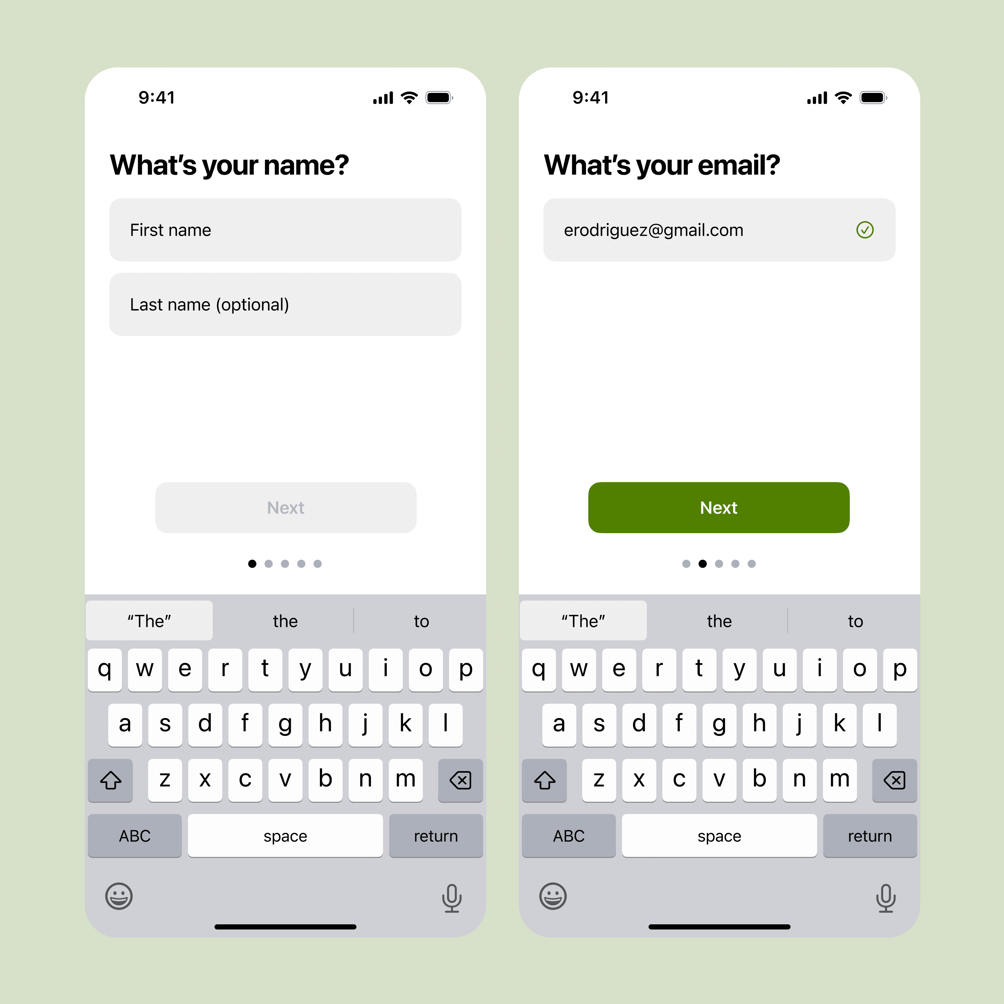
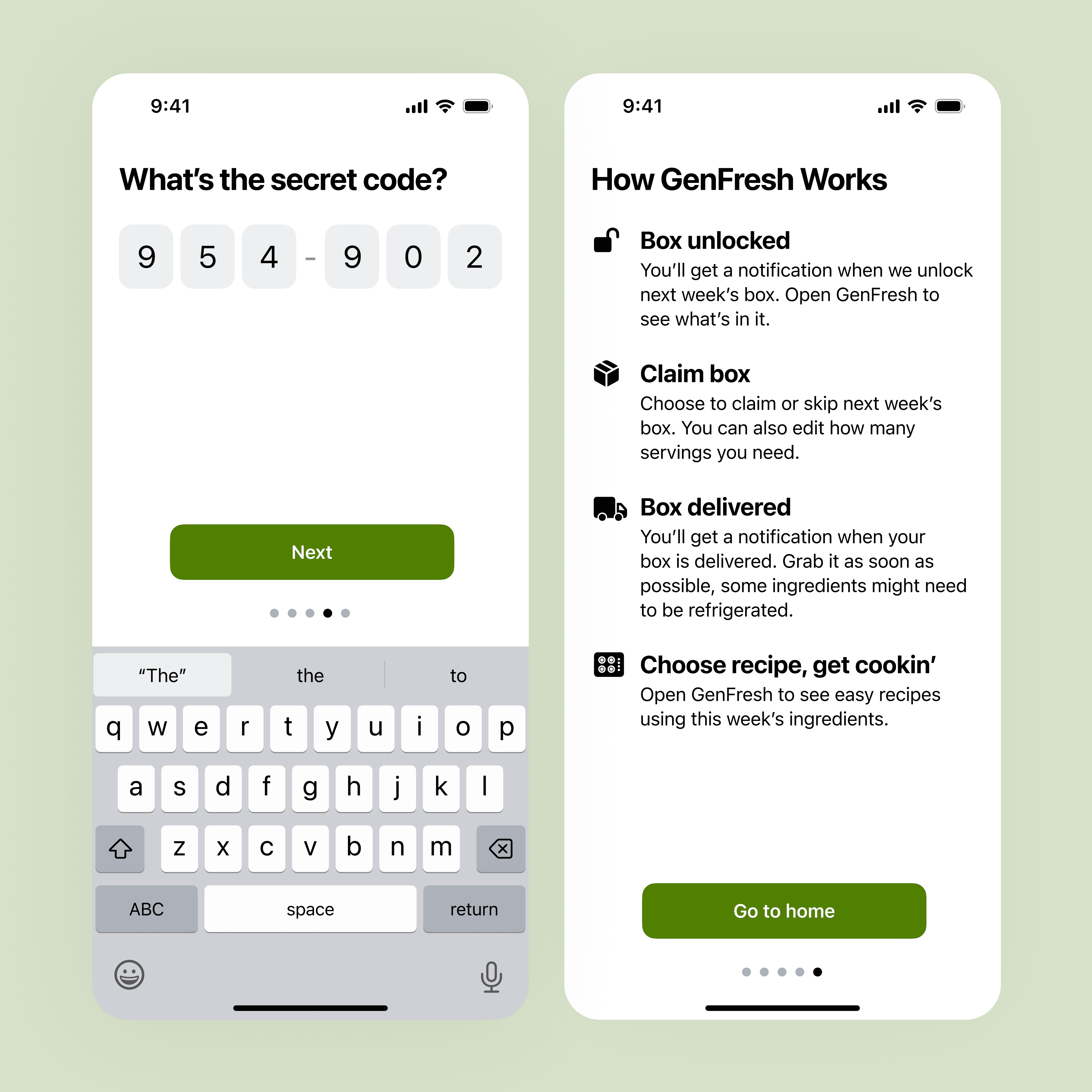
Onboarding screens.


Onboarding screens.


Onboarding screens.
Finally, I linked all the high-fidelity screens to create an interactive prototype.
Walkthrough of final prototype.
Finally, I linked all the high-fidelity screens to create an interactive prototype.
Walkthrough of final prototype.
Finally, I linked all the high-fidelity screens to create an interactive prototype.
Walkthrough of final prototype.
Digesting the Experience
I believe GenFresh serves as a compelling proof-of-concept. Though I haven’t tested it with the intended audience, I would be eager to see how it resonates. Given more time, I would:
Allocate additional research time to ensure cultural sensitivity
Convert nutrition education articles into interactive tap-through stories for better engagement
Capture food photography myself for visual consistency (as opposed to using Unsplash)
Develop a more robust gamification system to enhance user experience
Design more sections and screens to provide even greater value
In the final critique, GenFresh was met with resounding positivity from my peers and professor. This project has become one of my favorites, exemplifying my commitment to leveraging human-centered design principles to drive positive change and create products that make a meaningful contribution to society. I look forward to crafting more solutions like GenFresh that address societal issues.
Project Details
My Role
Creator UX Researcher UI Designer
Tools
Figma
Timeline
5 weeks
Related Work
User Experience
User Experience
User Experience
© 2025 Max Stromfeld
All wrongs reserved
© 2025 Max Stromfeld
All wrongs reserved
© 2025 Max Stromfeld
All wrongs reserved
