Trio of event posters as a study in visual hierarchy.
Read more
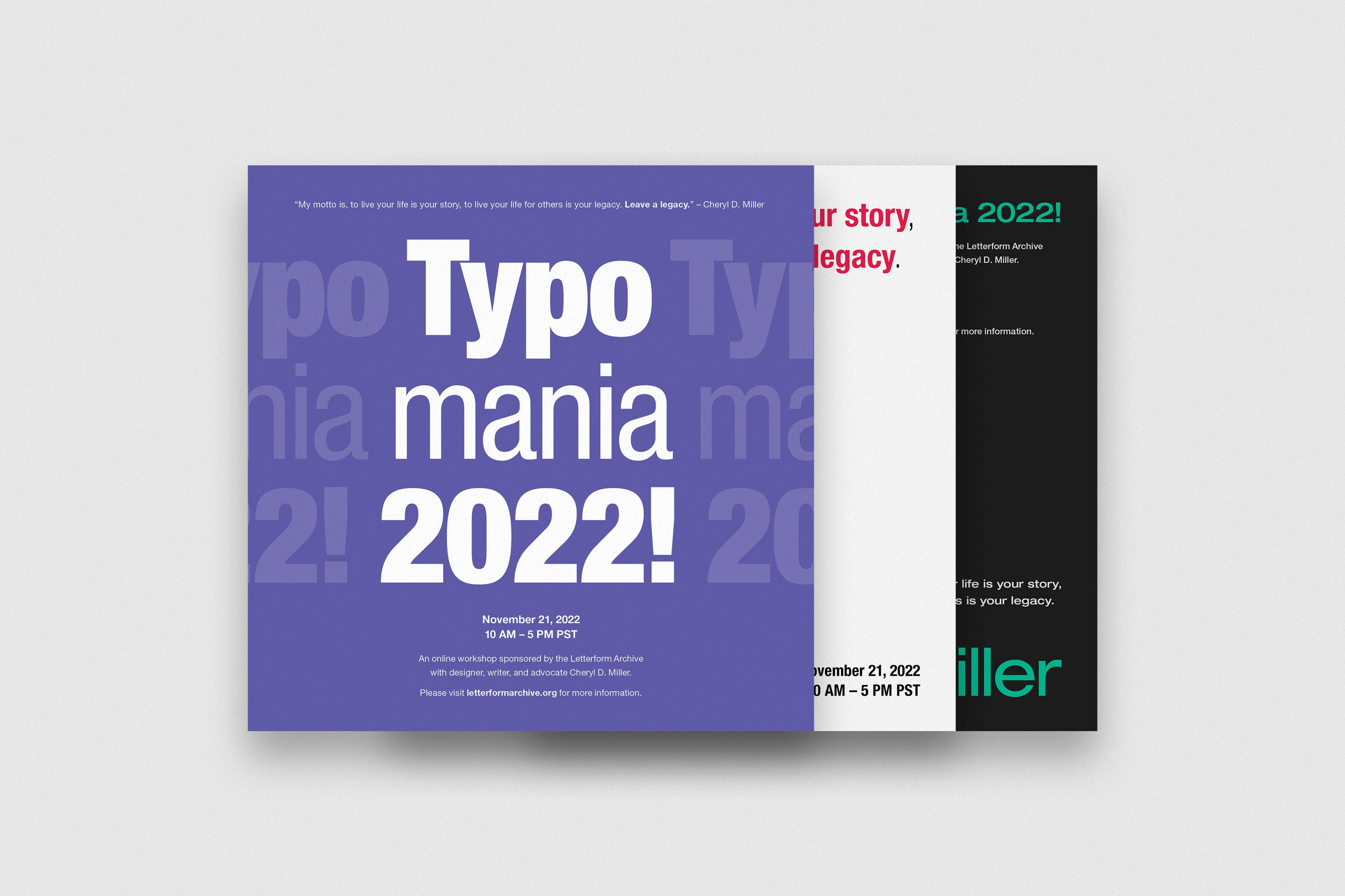
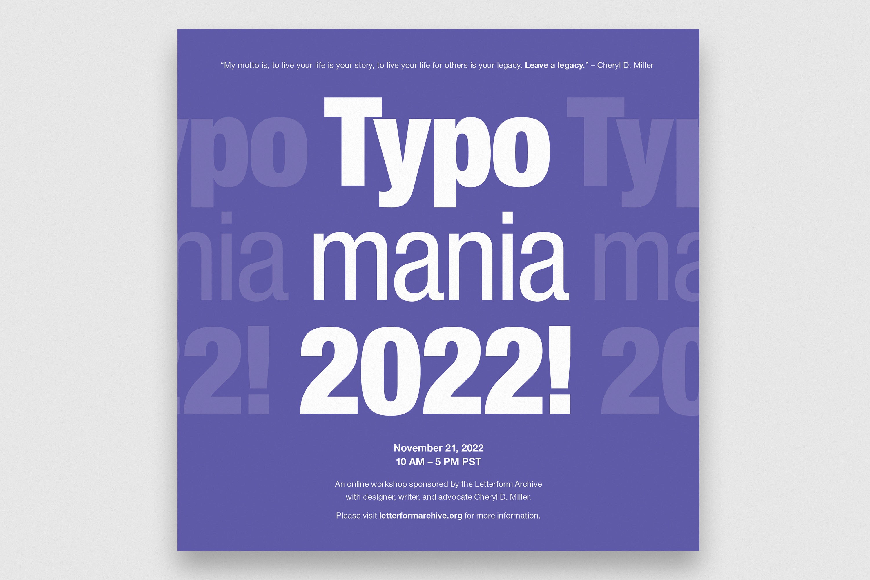
In poster one, I utilized a bold violet background and strong typography to draw attention. I decided on a center-weighted composition to decrease the cognitive effort required to scan the information and balance the colorful background.
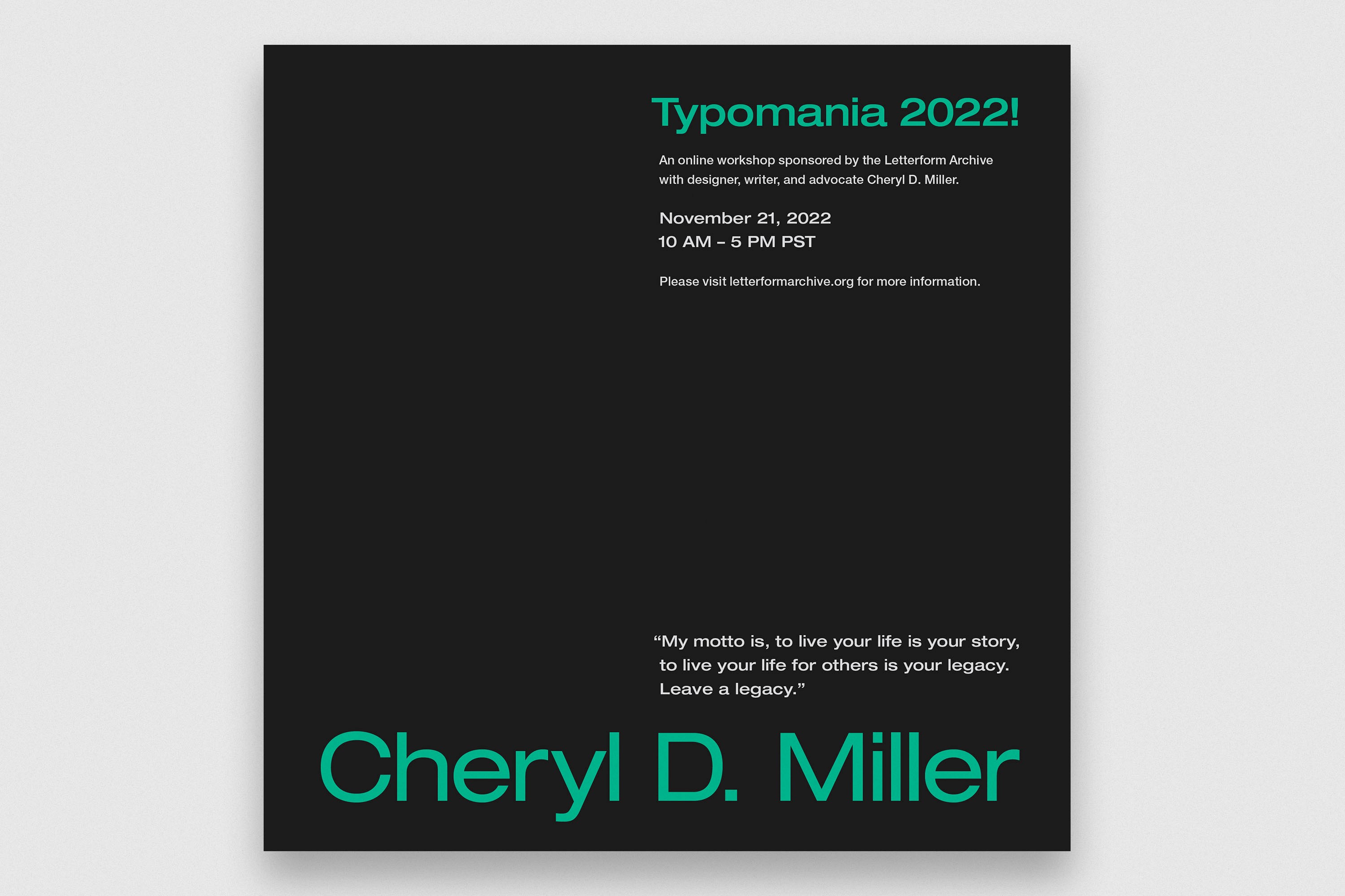
I explored more risky compositions in poster two, eventually landing on a bottom-weighted two-column layout. The dark negative space contrasts light walls, and the soft green accent provides subtle visual interest.
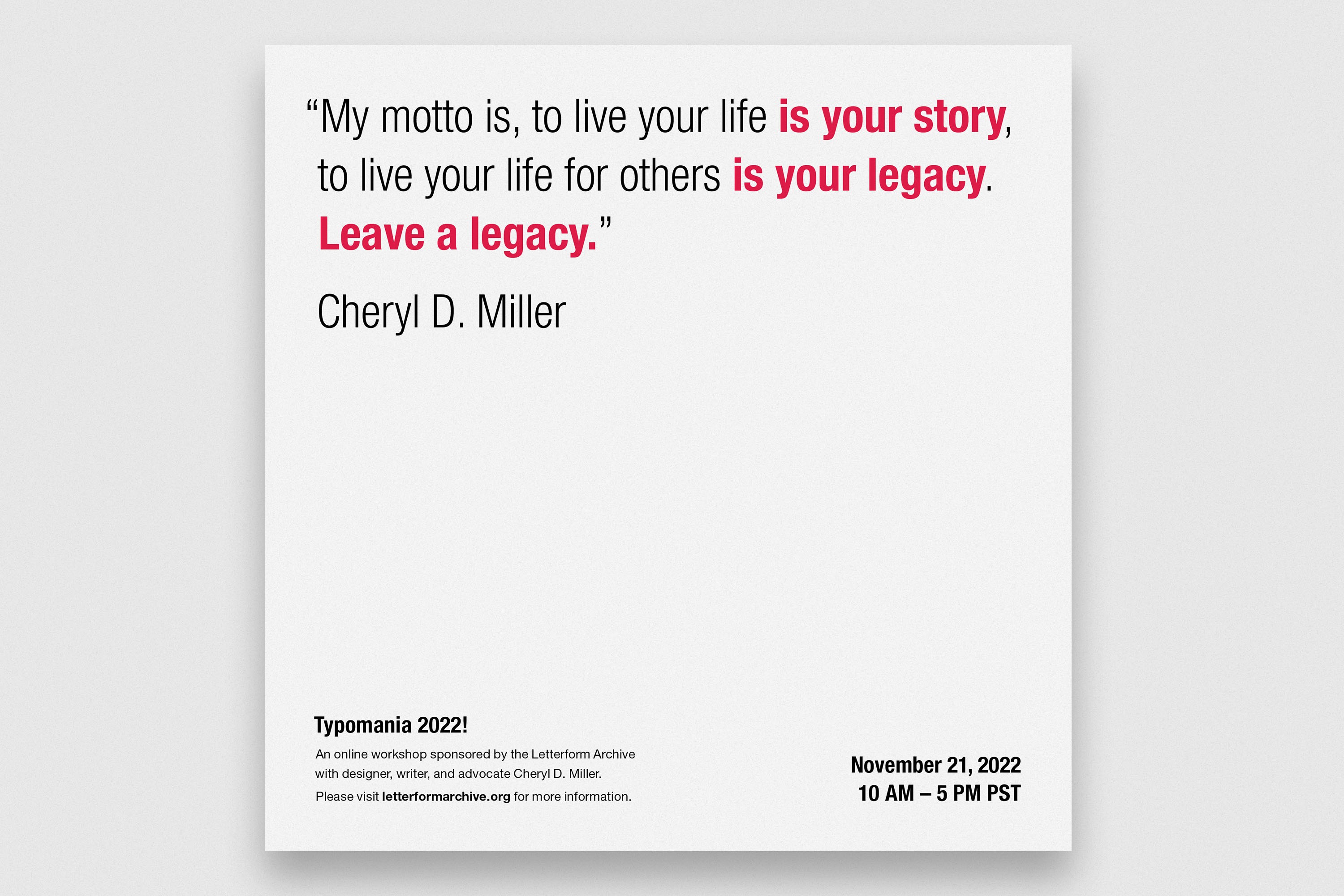
Poster three is light and airy, pausing only to emphasize the most critical information. I chose a red typographic accent to selectively stimulate the viewer and showcase the quote’s passion.