Conceptual redesign of the popular learning management system.
Read more
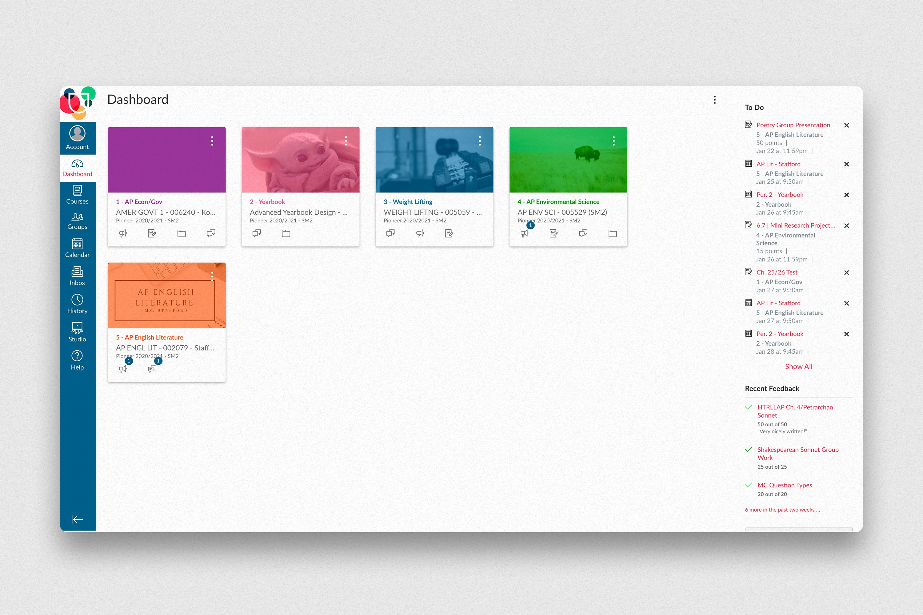
After examining the current website, I defined three main problems: Canvas was unnecessarily complex, dull, and fatiguing. The main navigation bar contains numerous unnecessary items and dashboard space is used inefficiently. The overall design lacks personality, clear calls to action, and accessible elements.
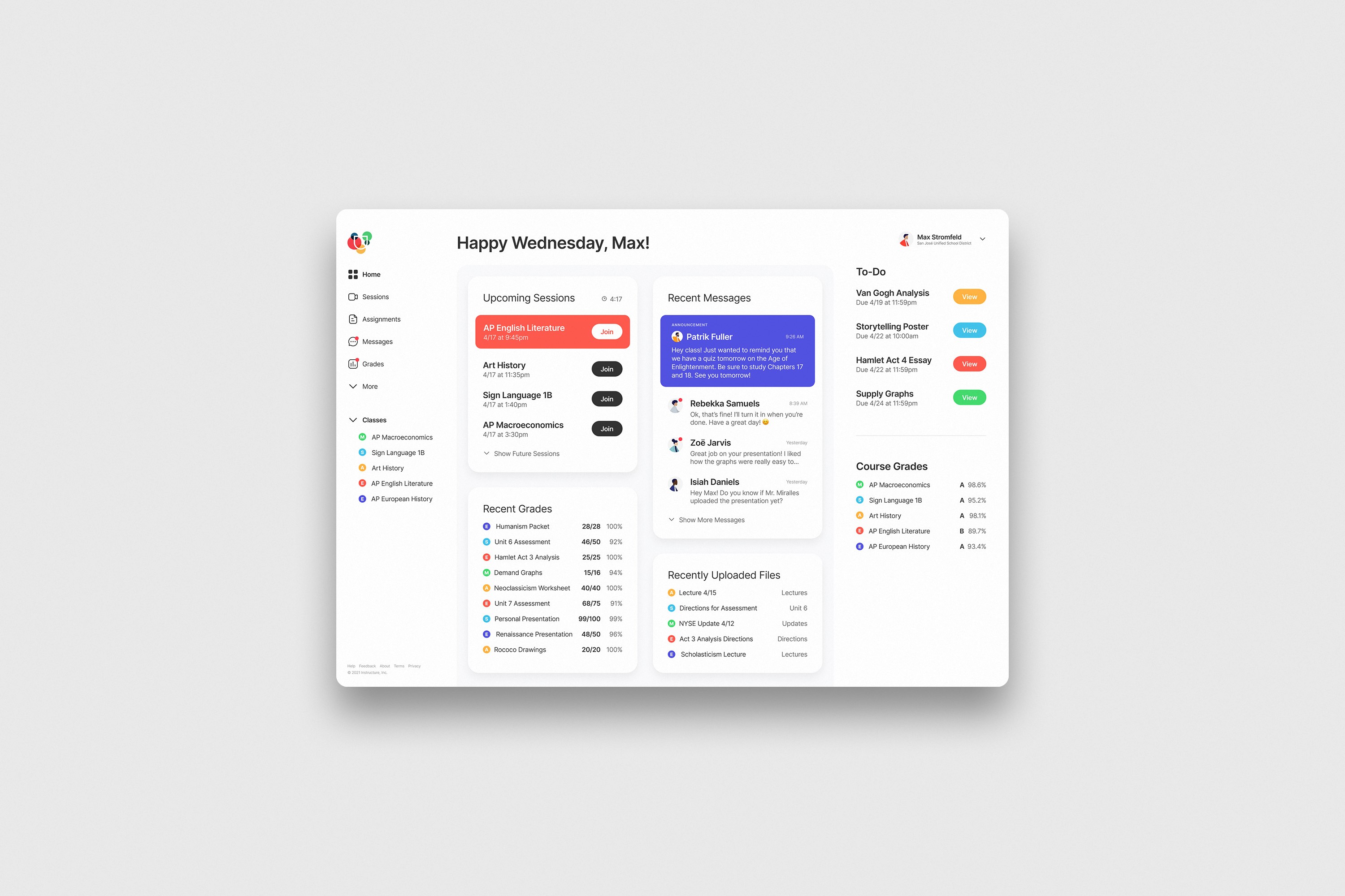
My version of the dashboard is drastically simplified. Only the most important links are shown, and content is displayed more effectively. To help make virtual learning more exciting, I added an encouraging welcome message, personalized avatars, and colorful course labels to help students quickly recognize classes. I also pursued adequate sizing, spacing, contrast, and hierarchy to make the product more accessible.